
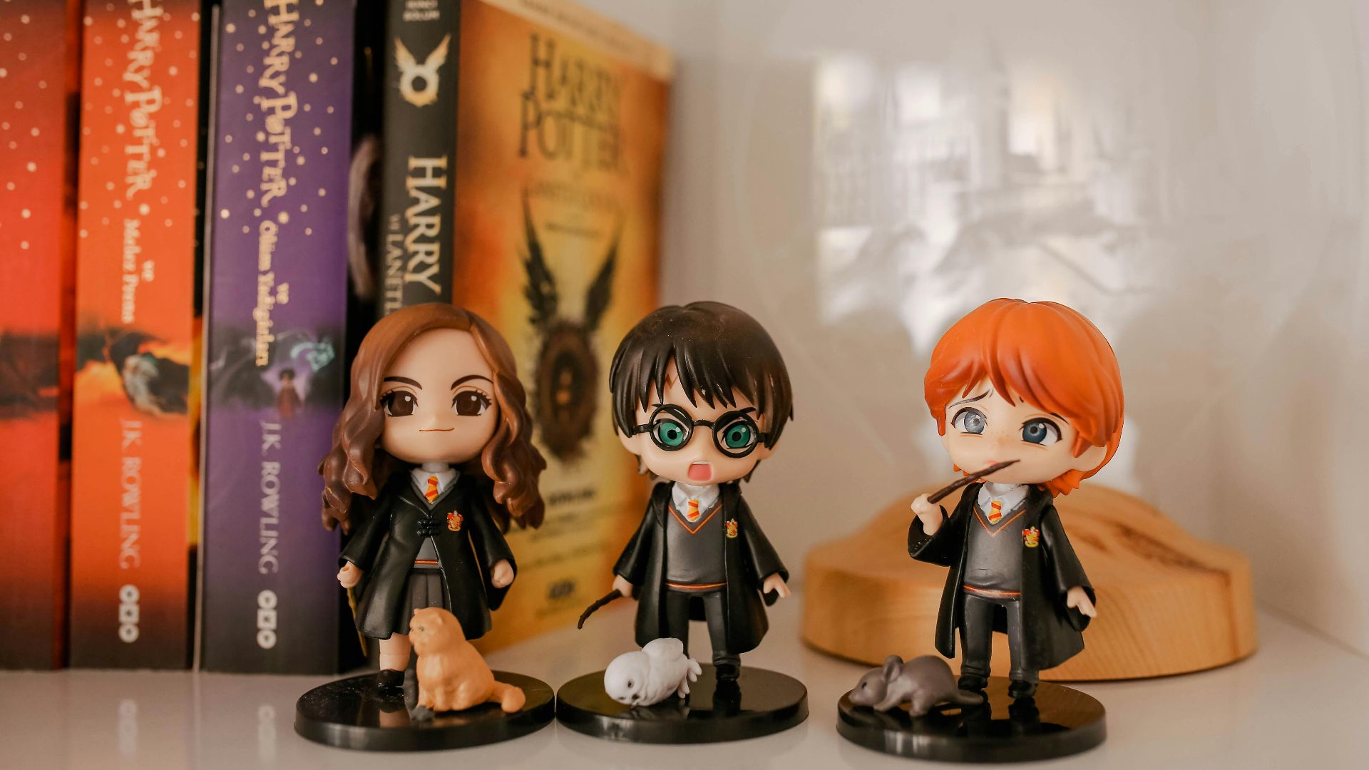
10 Harry Potter Tattoos That Don't Age Well & 10 That Do
The Trick Is Choosing the Ink You’ll Still Like After the Nostalgia Fades
Harry Potter tattoos can be genuinely meaningful, but “timeless” depends on what you choose to put on your skin and why. Some designs age poorly because they’re too trendy, too literal, or tied to symbols you may not want associated with you forever. Others hold up because they’re subtle, artful, and focused on themes like courage, friendship, or curiosity rather than a loud fandom stamp. Here are 10 Potter tattoos that often don’t age well, and 10 that you'll still like at 35.
1. The Tiny Lightning Bolt
A little lightning bolt is probably the most common Potter tattoo out there, which is exactly why it can start to feel generic. On its own, it can read like a random symbol rather than a meaningful reference. You can still love it, but it’s often the one people end up wishing they’d personalized more.

2. A Big Dark Mark
The Dark Mark is instantly recognizable, but it’s also tied to a fictional group you’re not exactly supposed to admire. Large placement makes it harder to “just be a book thing” when you’re in a workplace or meeting new people. It can also look intense even to fans. If you’re committed to the idea, many people prefer a more subtle nod instead of the full emblem.
3. “Always” in Basic Cursive
“Always” is popular because it’s short and emotional, but the most common version is the same thin script in the same placements. What's more, Snape's attachment to Lilly was kind of toxic and not exactly something to strive for. If you want it, a more custom font or pairing it with imagery usually helps.

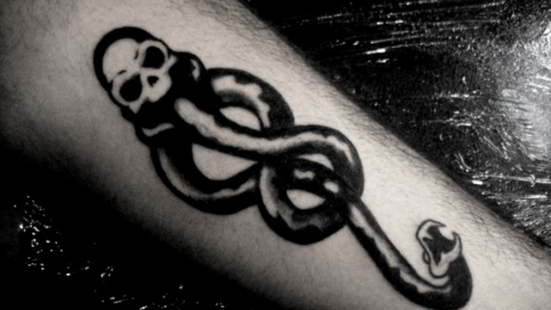
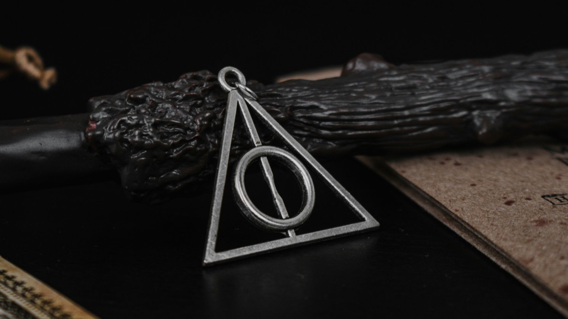
4. The Deathly Hallows as a Big Standalone Logo
The Deathly Hallows symbol is beloved, and it can make a cool tattoo if it's minimal and not too large. When it’s large and centered, it can start reading like a brand mark rather than personal art. It's also been done so many times that it's lost its uniqueness.
5. “Mischief Managed” as a Forearm Stamp
This phrase is fun, but it’s also one of the most copied Potter text tattoos in existence. If it’s done as a straight stamp in a trendy font, it can lock you into a specific era of tattoo style. Text-only designs also depend heavily on spacing and line weight to stay readable over time.
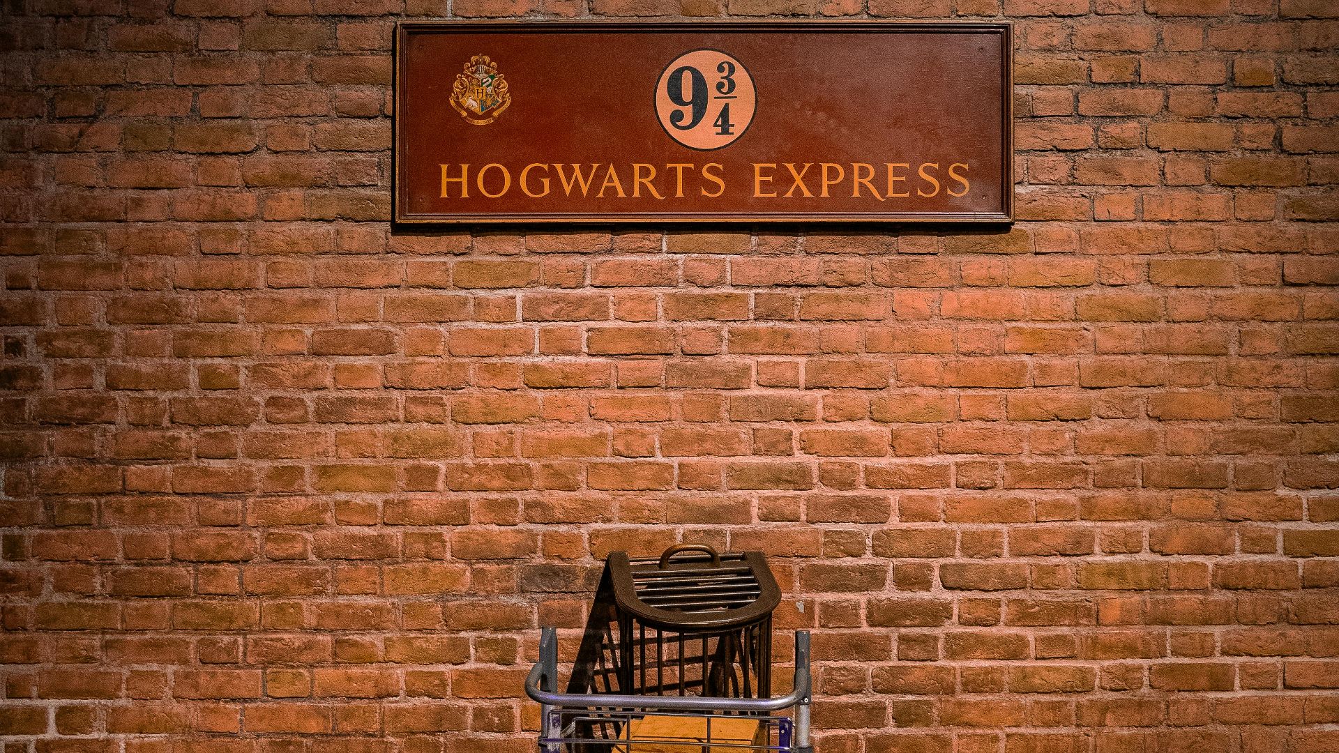
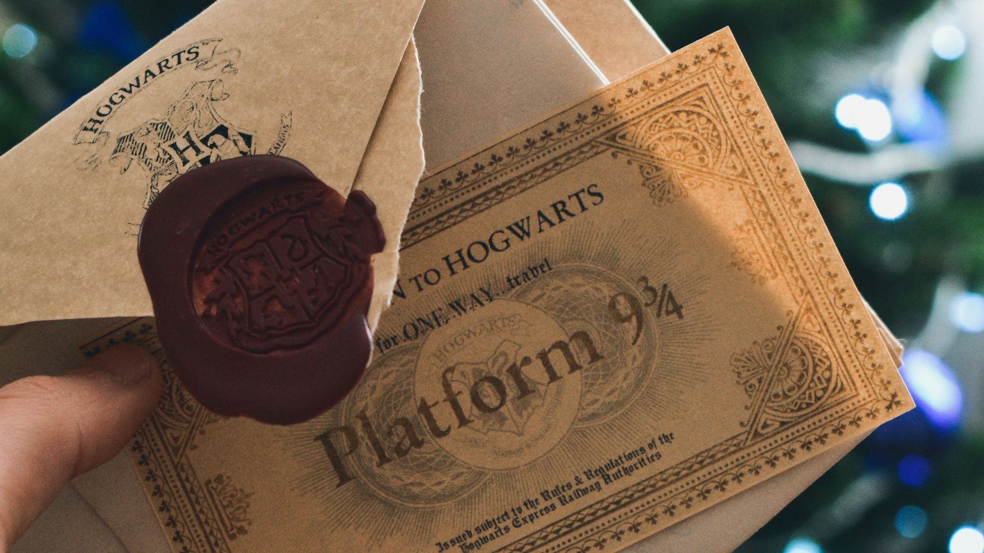
6. Platform 9¾ in Sign-Style Typography
The number is iconic, but sign-style designs can feel too literal. Some versions look like a travel sticker that accidentally became permanent. If you’re not careful with sizing, the numbers can blur, and the meaning gets lost. A quieter train-themed reference or just the number in minimalist text tends to hold up better than copying the station sign.
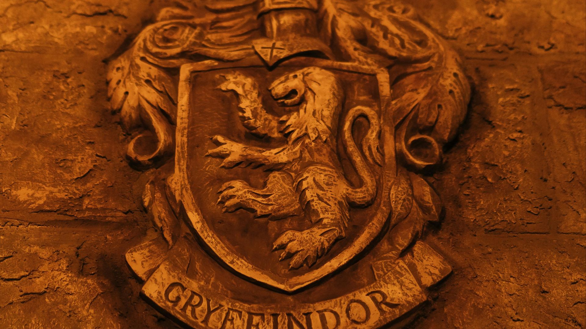
7. House Crest Shields in Bold Color
Big Hogwarts crest tattoos are popular, but they can age unevenly because large color fills fade and shift over time. The more tiny details you pack into a shield, the faster it can lose clarity. It can also feel like you’re permanently announcing your house identity to everyone you meet. If you still want house pride, simpler symbols usually age more gracefully.
8. A Full Character Portrait
Portraits are high-risk no matter what fandom they’re from. A great portrait requires a specialist, and even then, faces can age in ways that get weird fast. You also might not want someone’s face on your body forever, even if you love the character today. When people regret fandom tattoos, portraits are often at the top of the list.
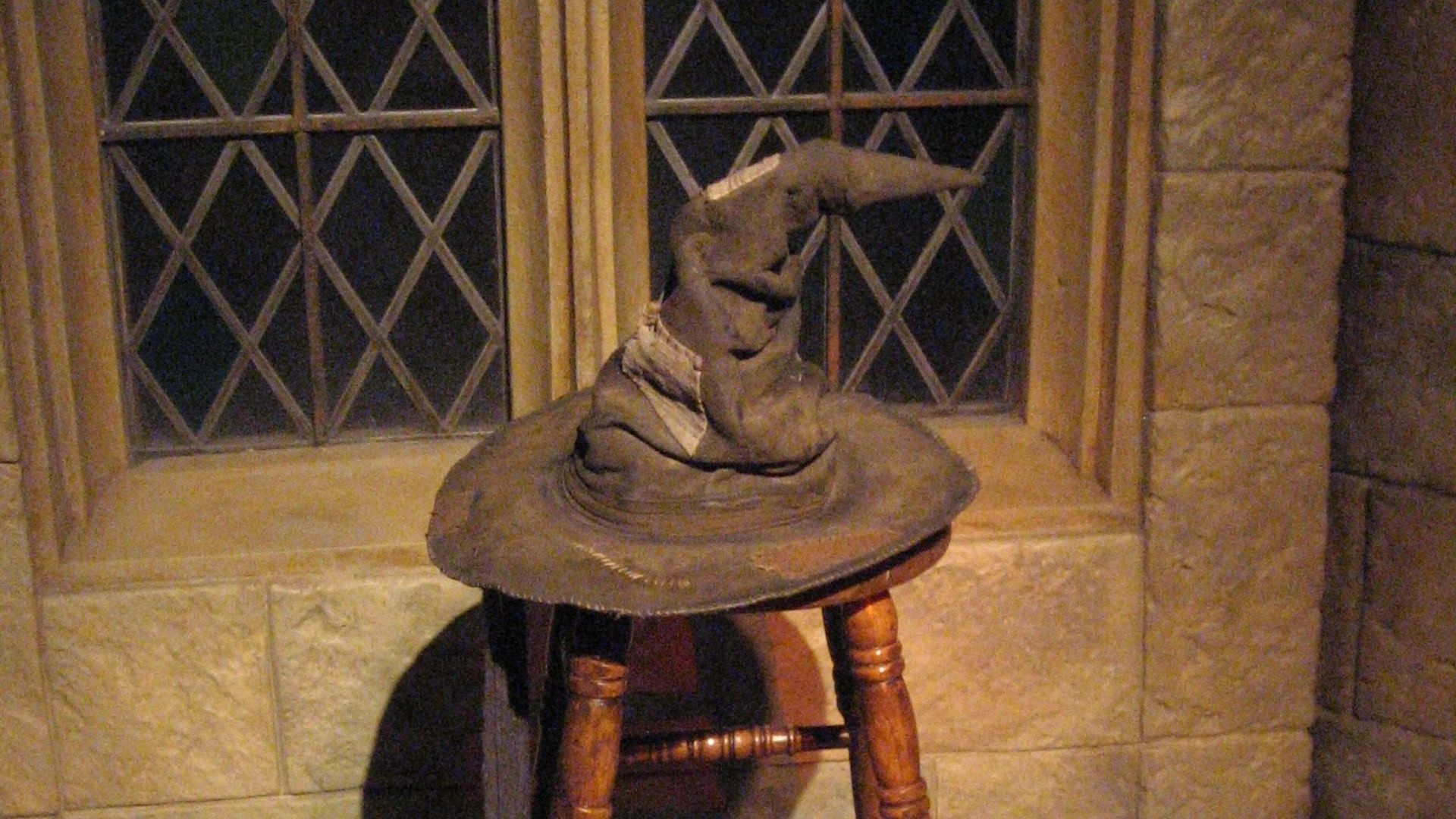
9. The Sorting Hat With a Quote
The Sorting Hat is a classic, but pairing it with a line from the book or movie is too literal and easy to outgrow. If the quote is long, the lettering can become the weak point later. A Hat design can be tasteful and timeless, but adding words can make it risky.
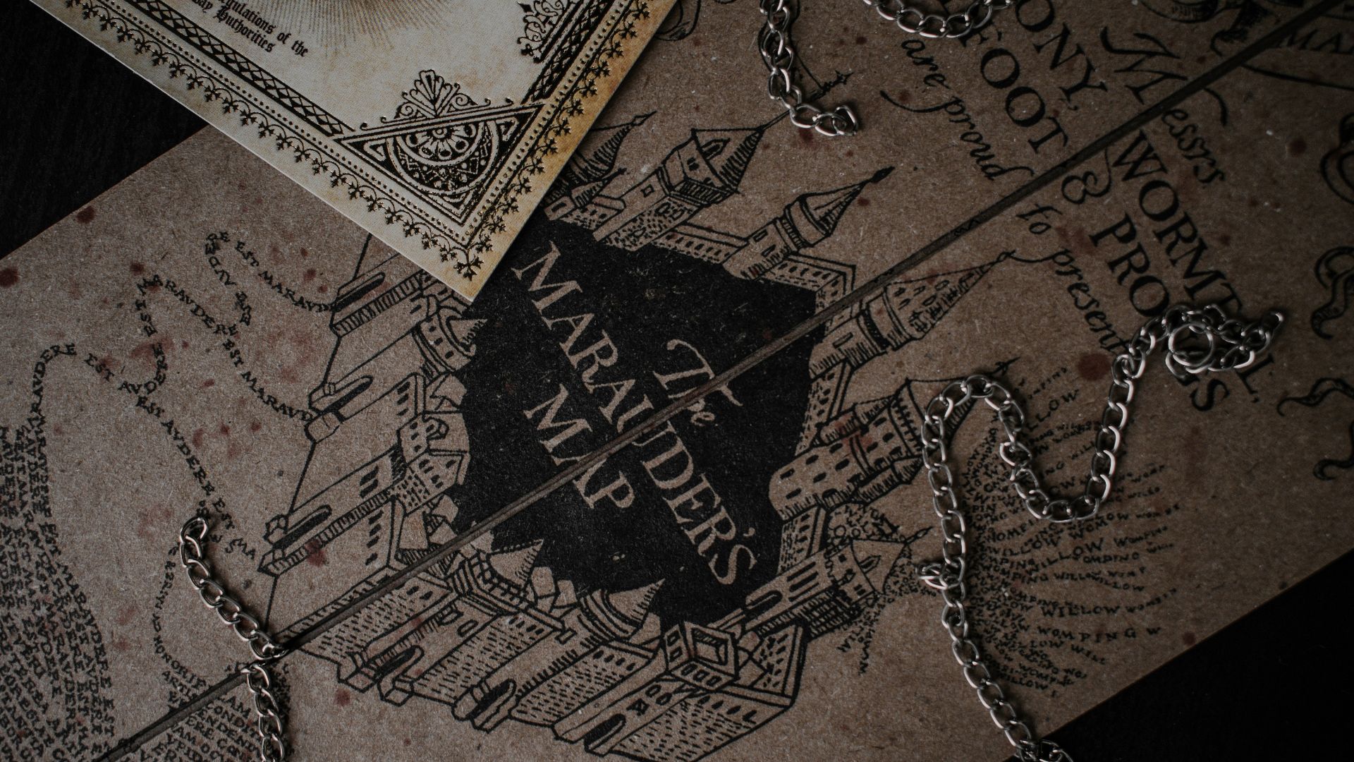
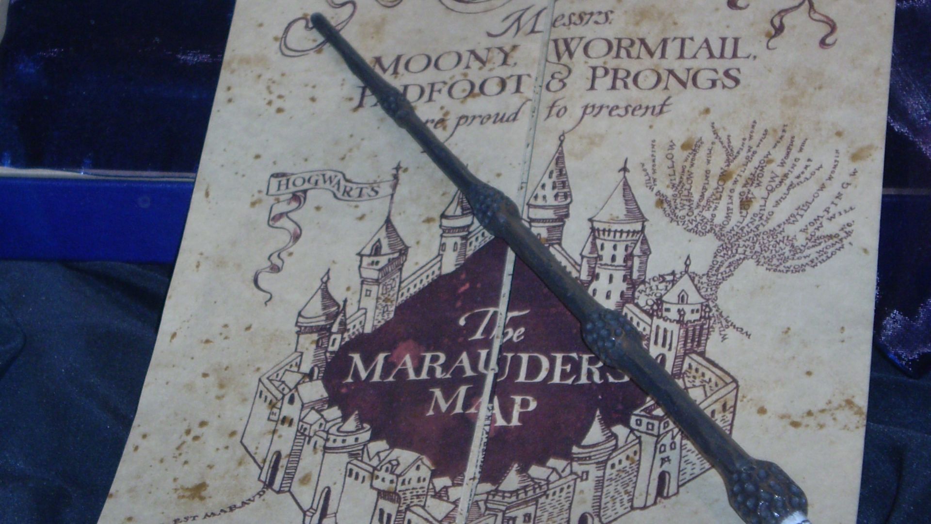
10. The Full Marauder’s Map Layout
The map is a fan favorite, yet full layouts often involve lots of tiny lines and text. Fine details tend to soften, and suddenly your “masterpiece” looks busy and hard to read. It’s also easy for it to become a blob if it’s done too small or on a high-movement area. A simplified map element tends to stay cleaner.
Now that we've covered the Potter tattoos that you'll quickly outgrow, let's talk about the ones that you're less likely to hate by the time you're 40.
1. A Custom Patronus
Patronus tattoos age well because they’re personal and visually flexible. You can choose a style that fits you, like minimal linework, soft illustration, or a more dramatic silhouette. Even if someone doesn’t catch the reference, it still looks like a cool animal tattoo.

2. The Hogwarts Seal
The Hogwarts seal is instantly recognizable to fans, but it still reads like a classic heraldic design to everyone else. Because it’s symmetrical and graphic, it tends to age better than tiny, detailed scenes or long quotes. It also works in a bunch of styles, from clean linework to bold blackwork, so you can match it to your overall tattoo vibe.
 Serafima Lazarenko on Unsplash
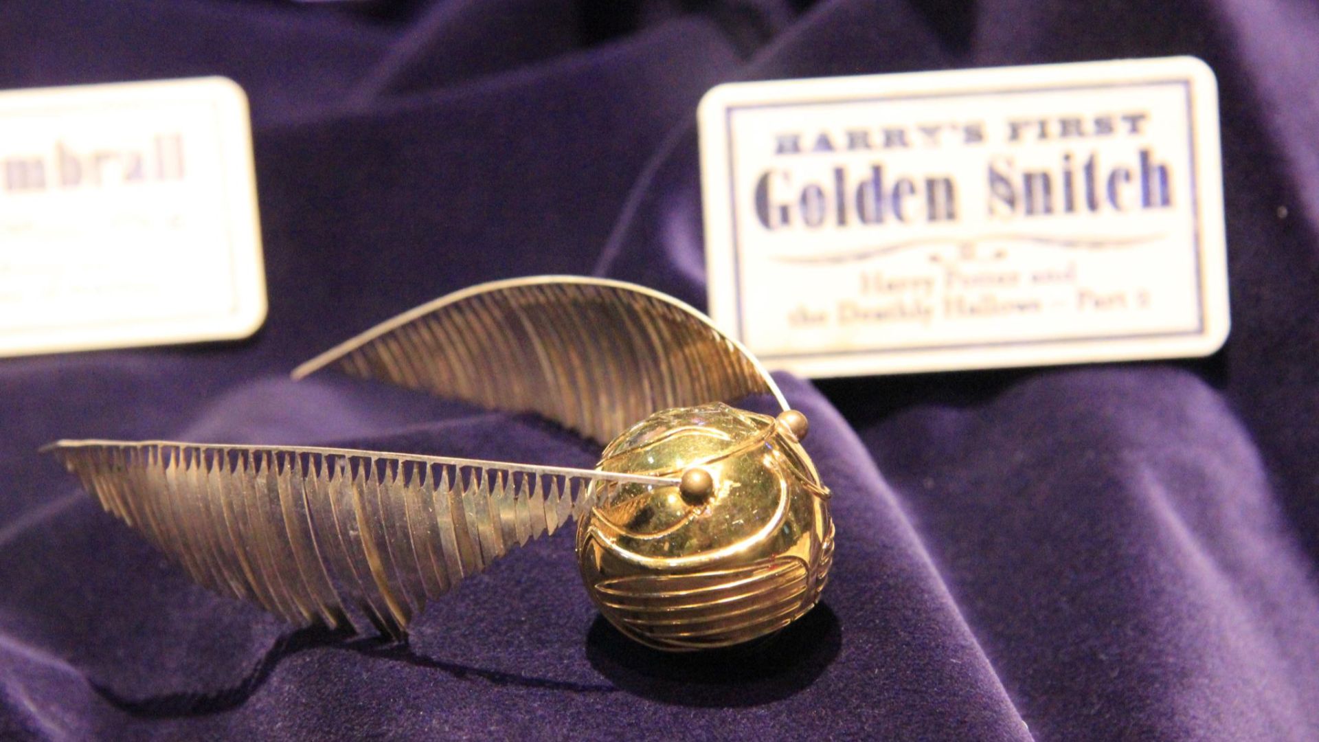
3. The Golden Snitch
The Snitch is popular for a reason: it’s recognizable, compact, and easy to place. It can be tiny and still readable, which makes it a great option if you prefer understated tattoos. The design also holds up well because it doesn’t rely on text or micro-detail. If you want an iconic symbol without a loud vibe, this is a safe bet.
4. Marauder’s Map Footprints
Those tiny moving footprints from the Marauder’s Map are a subtle reference that still feels playful without being loud, and can also symbolize a love of travel or wandering. It works in lots of placements, like along an ankle, wrist, or collarbone, where it can look like it’s roaming naturally. If you want Potter ink that feels clever and low-key, this one tends to hold up really well.

5. “All Was Well” in a Timeless Style
Only true fans of the books know that these are the last three words of the final book. Since the phrase is short, it’s easier to keep readable over time with proper spacing and line weight. It also works as a standalone sentiment, so it doesn’t feel awkward if your fandom intensity changes.

6. A Minimal Hogwarts Castle or Skyline
The castle is one of the most beloved images in the entire series, and it translates beautifully into simplified linework. It also looks good even if someone doesn’t know what it is, which helps it age in social settings. Scale it properly, and it keeps its charm without turning into clutter.

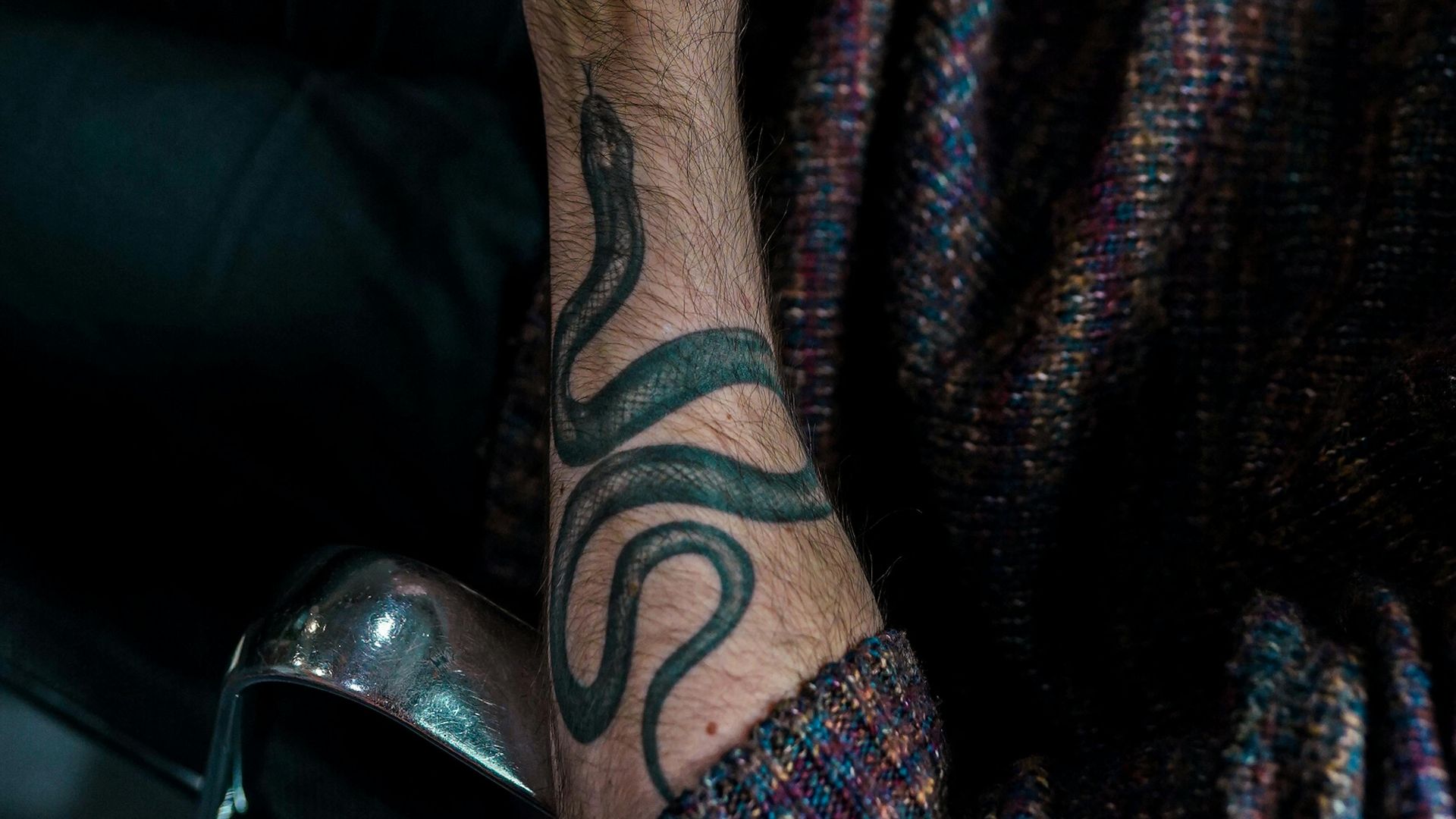
7. A Small House Animal in Clean Linework
Instead of a full crest, the animal alone gives you the reference with far less baggage. A lion, snake, badger, or eagle can look timeless as a simple tattoo, even outside the Harry Potter context. It’s also easier to refresh later if you ever want to build around it. Subtle house pride is usually the long-game winner.
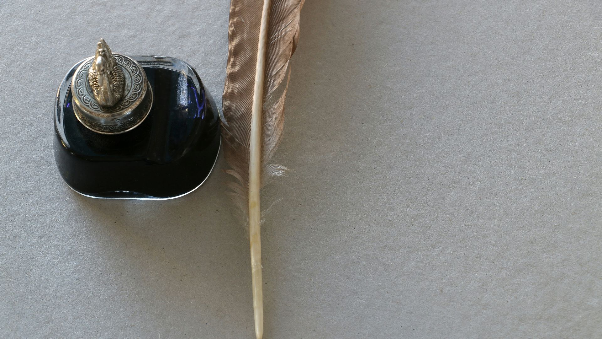
8. A Quill & Ink Bottle
This is a popular choice for people who love the “school” side of the world without using obvious logos. A quill can represent learning, writing, and that old-library vibe the series leans into. It’s flexible enough to feel meaningful even beyond Potter. It also looks great in many tattoo styles, from fine line to traditional.
9. The Three Stars
That tiny three-star symbol from the original book page designs is a low-key deep cut that real fans recognize. It’s minimal, clean, and doesn’t rely on faces, logos, or long text to make sense. If you want a subtle Potter tattoo that feels a little more for the OG readers, this is a great choice.
10. Minimal Harry Potter Glasses
The round glasses are one of the most recognizable symbols in the whole series, but they’re subtle enough to stay wearable for the long term. In a clean, minimal outline, they read as simple design first and fandom second, which helps if your relationship with the franchise changes. They also age well because they’re made of bold, simple shapes that won’t turn into a blur of tiny details.