The Best Interfaces Make Complex Information Feel Simple
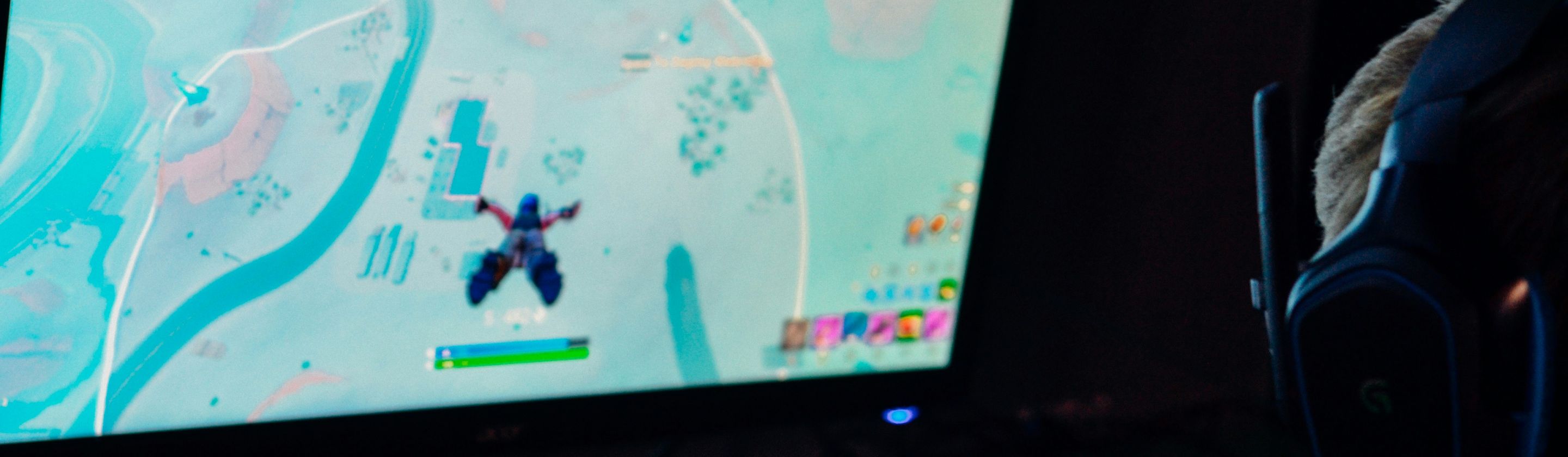
A smart user interface helps players understand what’s happening without pulling attention away from the action. When health, objectives, resources, menus, and warnings are presented clearly, players often absorb the information automatically, which means the design succeeds precisely because it doesn’t demand to be noticed. Here are 20 smart UI designs that players don't even notice.

1. Health Bars Change Before You Read Them
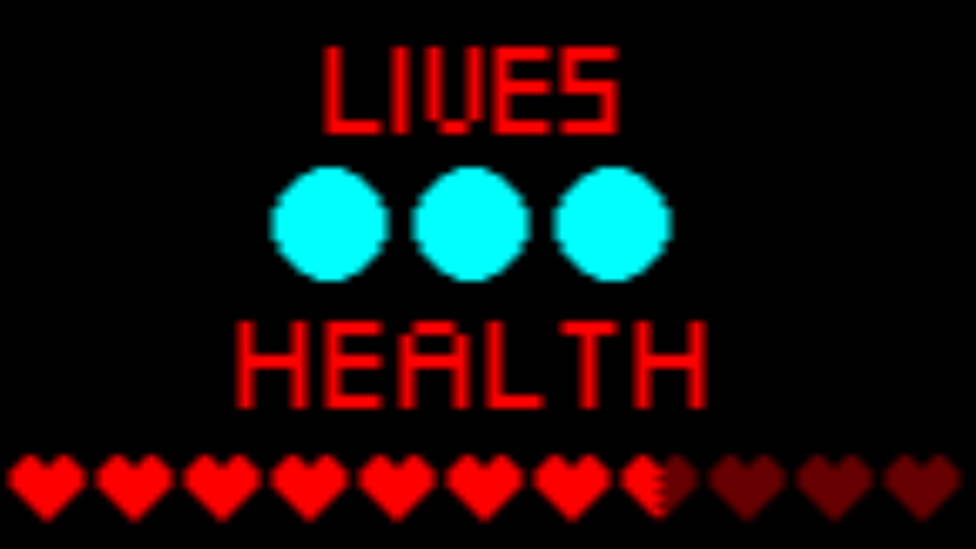
A well-designed health bar doesn’t rely only on a number, because its color, animation, and shape can communicate danger instantly. Green may shift toward yellow or red as health drops, while flashing or pulsing adds urgency at critical levels.
2. Important Icons Stay In Consistent Places
Players build visual habits when ammunition, abilities, maps, and objectives remain in predictable areas of the screen. Consistent placement reduces the time spent searching for information during fast moments. Even when the interface changes between menus and gameplay, familiar positioning helps everything feel easier to understand.

3. Menus Remember Your Last Selection
Returning players often appreciate it when a menu reopens on the tab, character, or item they were using most recently. This small feature removes repeated navigation and makes common tasks feel faster. Most people won’t praise it directly, but they’ll notice immediately when another interface forgets their place.

4. Objective Markers Fade At The Right Time
Permanent markers can make a screen feel crowded, while markers that vanish too quickly leave players confused. Strong interface design adjusts their visibility depending on distance, direction, and relevance. A marker may brighten when you’re lost and become subtle once the correct path is obvious.

5. Damage Direction Appears Instantly
When an attack comes from outside the camera view, directional indicators show where the danger originated. The best versions use simple shapes or screen-edge effects that can be understood during movement. Players turn toward the threat without consciously studying the symbol or breaking their concentration.

6. Cooldown Timers Use Motion As Well As Numbers
A countdown number is useful, but a filling circle or shaded icon can communicate ability readiness more quickly. Motion gives players a rough sense of timing even when they aren’t looking directly at the display. By combining visual progress with precise numbers, the interface supports both quick reactions and careful planning.
7. Text Size Changes With Importance
Not every message deserves equal attention, so smart interfaces establish a clear hierarchy through size and placement. Major objectives appear prominently, while optional updates remain smaller and less intrusive.

8. Contextual Buttons Appear Only When Needed
Displaying every possible control at all times would overwhelm most players. Contextual prompts appear only when a nearby object, character, or action makes them relevant.

9. Inventory Items Sort Themselves Logically
Good inventories group objects by purpose, rarity, type, or recent use instead of presenting one enormous unsorted collection. Filters and automatic sorting help players locate equipment without turning organization into a separate chore. The system feels straightforward because the underlying design handles much of the complexity quietly.

10. Map Symbols Use More Than Color
Relying entirely on color can create confusion, especially for players with color-vision differences or those using screens with unusual settings. Smart maps combine color with distinct shapes, outlines, labels, and patterns. These extra cues make locations easier to identify without requiring players to memorize subtle color differences.

11. The Interface Responds To Your Current Activity
A screen used during exploration doesn’t need the same information as one used in combat, crafting, or conversation. Adaptive interfaces hide less relevant elements and bring useful details forward as situations change.

12. Warnings Escalate Gradually
Effective warnings usually begin subtly and become more noticeable as the danger grows. A low resource may first change color, then flash, and eventually trigger a sound or stronger animation. This escalation informs players early without treating every minor problem like an emergency.
13. Buttons Show Their Current State Clearly
A control should look different when it’s selected, unavailable, highlighted, or actively being pressed. Changes in brightness, borders, movement, or sound confirm that the interface received the player’s input. Clear feedback prevents repeated clicks and reduces uncertainty, especially when menus respond slowly.
 Nikita Kachanovsky on Unsplash
14. Loading Screens Share Useful Information
Loading screens can do more than display artwork or progress indicators. Helpful designs use the time to show control reminders, gameplay tips, story context, or recent objectives.

15. Subtitles Identify More Than Spoken Words
Strong subtitle systems may include speaker names, directional cues, sound descriptions, and adjustable backgrounds. These features help players follow conversations when characters are off-screen or when environments are noisy.

16. Resource Counts Appear Near Related Actions
Players shouldn’t have to look across the entire screen to determine whether they can buy, craft, or upgrade something. Smart interfaces place the required cost beside the current amount, allowing immediate comparison.

17. Navigation Highlights The Next Logical Step
Complex menus can guide players by subtly emphasizing the most likely next action. A newly unlocked section may glow, a completed category may dim, or a notification dot may indicate unseen content.
18. Sound Confirms What The Eyes Might Miss
Interface sounds provide extra confirmation when items are collected, menus open, objectives update, or actions fail. Different tones can signal success, danger, scarcity, or completion even when the player is focused elsewhere.

19. The HUD Can Be Customized
Players vary in screen size, eyesight, experience, and tolerance for visual clutter, so one layout won’t suit everyone. Adjustable scaling, opacity, color, and element visibility allow the interface to fit individual needs.

20. Information Disappears When It Isn’t Useful
One of the smartest interface decisions is knowing when to remove something from view. Health bars, control prompts, and objective text may fade during calm moments, cutscenes, or exploration.