These Boxes Meant Everything
Some covers stick in your head long after you've beaten a game and it starts to collect dust on the shelf. Maybe it’s the mood, the color, or just something offbeat that makes it stand out. Over the years, cover art has quietly shaped how players remember a game. This list explores 20 of the best game covers that we just can't seem to forget.
 AVGN: Bad Game Cover Art #6 - Phalanx (SNES) by Cinemassacre
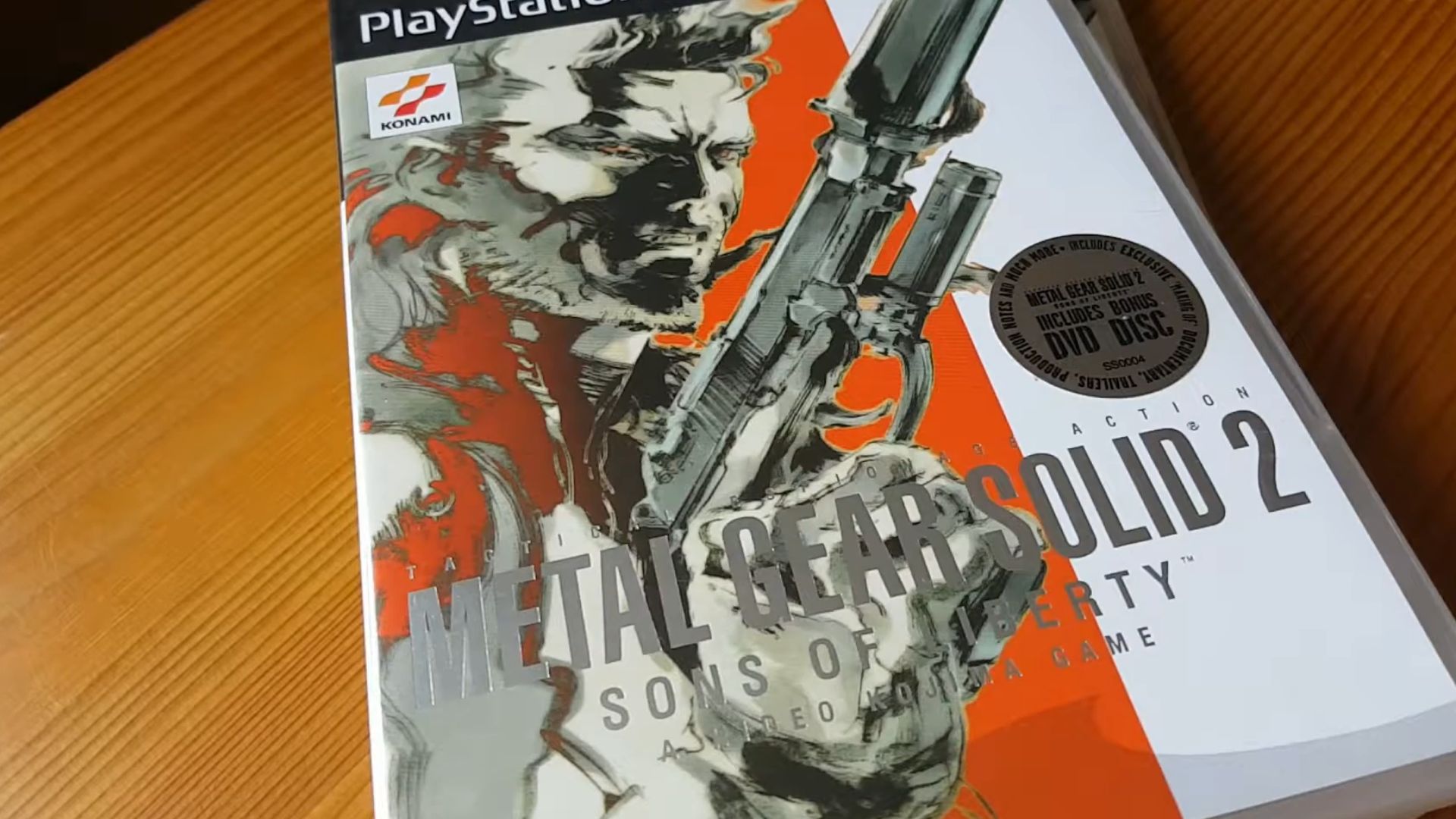
1. Metal Gear Solid 2: Sons Of Liberty (2001)
MGS2’s cover brought Yoji Shinkawa’s signature ink style of bold brushwork and grayscale tones front and center. Solid Snake, drawn with deliberate asymmetry, matched the game's themes of deception. The stylized approach foreshadowed the Raiden twist hidden just beyond that confident pose.
 Metal Gear Solid 2: Sons of Liberty - PAL Unboxing by Cosy Connoisseur
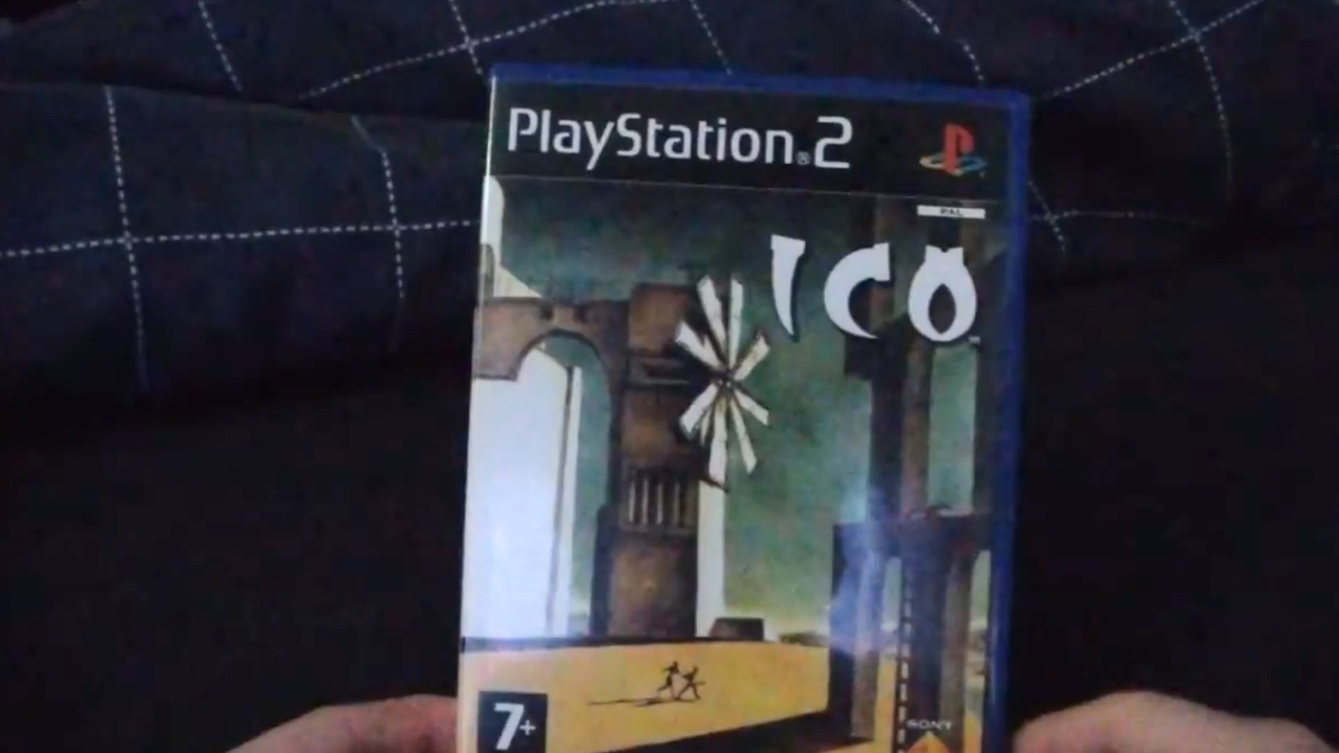
2. Ico (Japanese Cover, 2001)
Minimalism rarely hits this hard. Modeled after Giorgio de Chirico’s surrealist paintings, Ico’s Japanese cover evokes loneliness and curiosity. The tall shadows and empty sky mirror the game’s themes of isolation, with windmills representing unreachable freedom rather than progress.
 ICO Playstation 2 Unboxing by TimeSplitterChimp
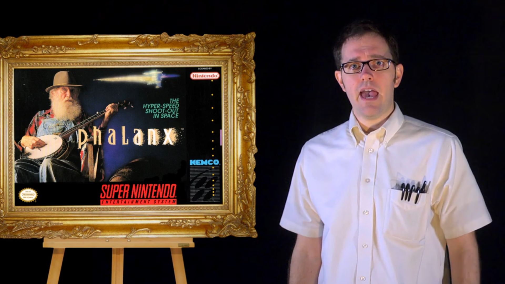
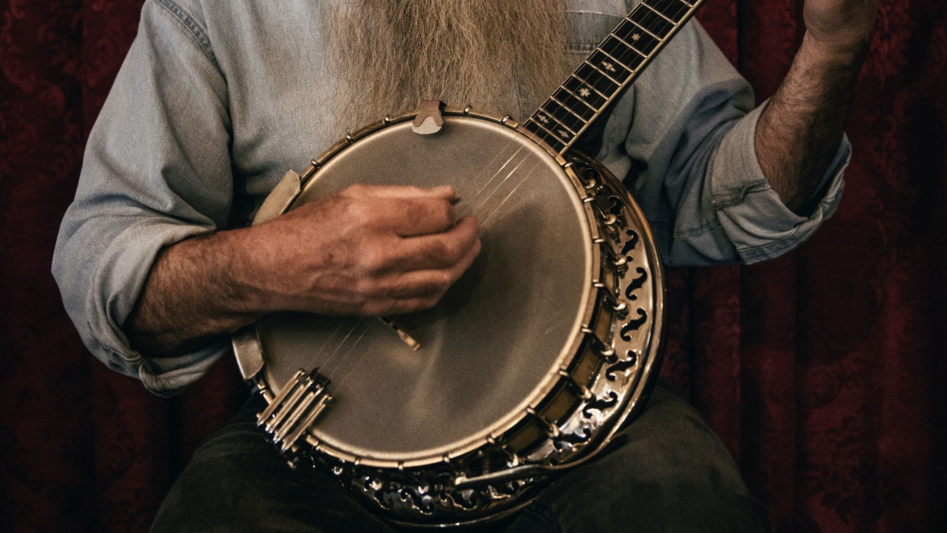
3. Phalanx (1991, SNES)
A banjo-wielding old man for a sci-fi shooter? That’s Phalanx. The U.S. box art tossed genre expectations out the window. As for the absurdity, it was marketing genius. It helped this otherwise average space shooter stand out on crowded rental store shelves dominated by sameness.
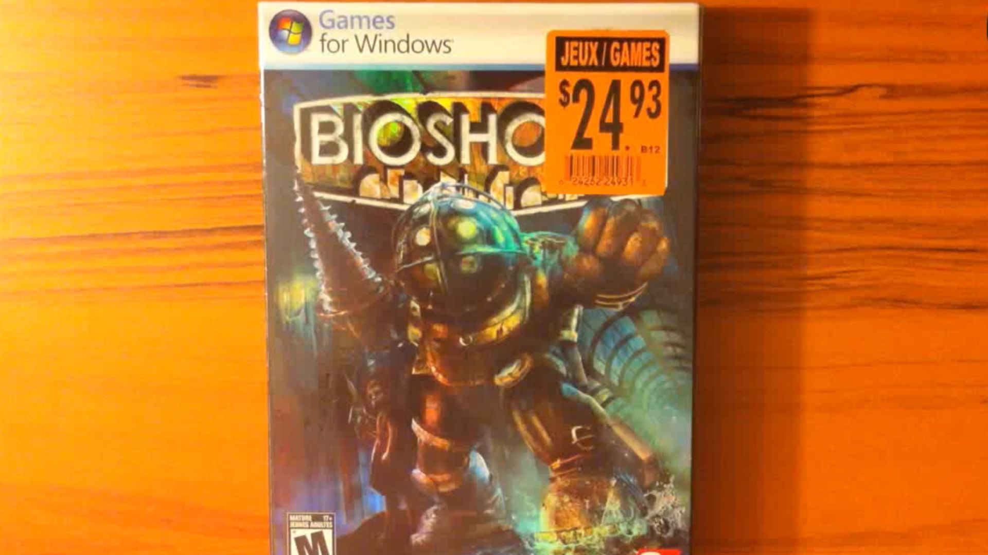
4. BioShock (2007)
Steel and sorrow collide on BioShock's haunting cover. A Big Daddy, menacing in his diving suit, looms beside a tiny, ghostly Little Sister. Artist Robb Waters hid faint, underwater brushwork behind the characters and blended art deco grit with horror. That eerie halo glow is thematic.
 (BS) BioShock 2007 Video Game Unboxing-Overview HD 720P by GhostXGaming
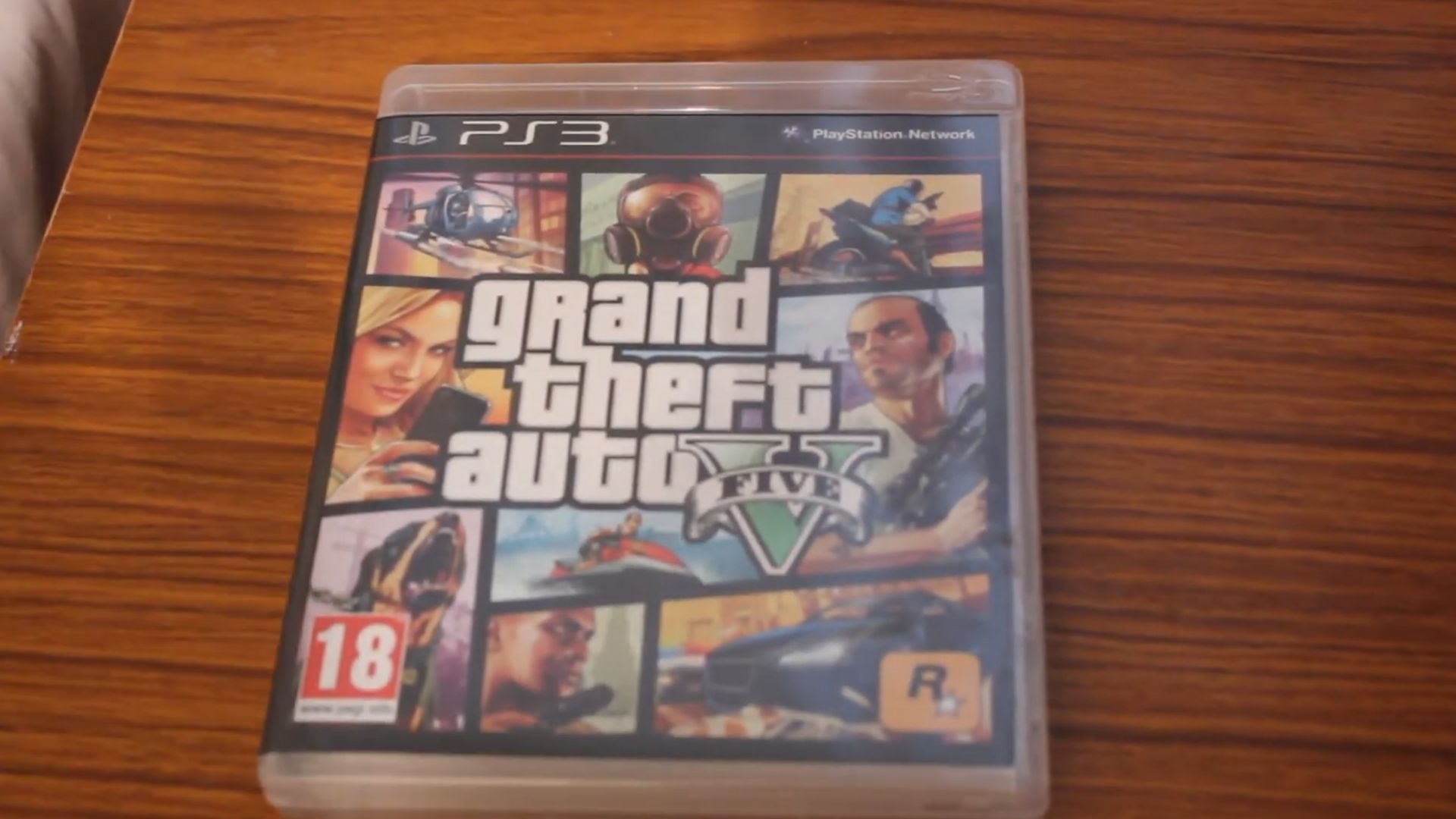
5. Grand Theft Auto V (2013)
A collage-style chaos made GTA V instantly familiar. The grid format nods to earlier GTA titles while capturing the game's sprawling urban mayhem. Franklin's dog Chop, Trevor’s rage, and Michael’s calm feature on the cover—each square teasing a different flavor of Los Santos.
6. Limbo (2010)
Silhouettes became unsettling in Limbo’s stark black-and-white cover. Indie studio Playdead featured a small, shadowed boy alone in a void—a depiction of fear. The hand-drawn outlines used a custom 2.5D rendering engine that echoes German Expressionist film techniques like chiaroscuro and backlighting.
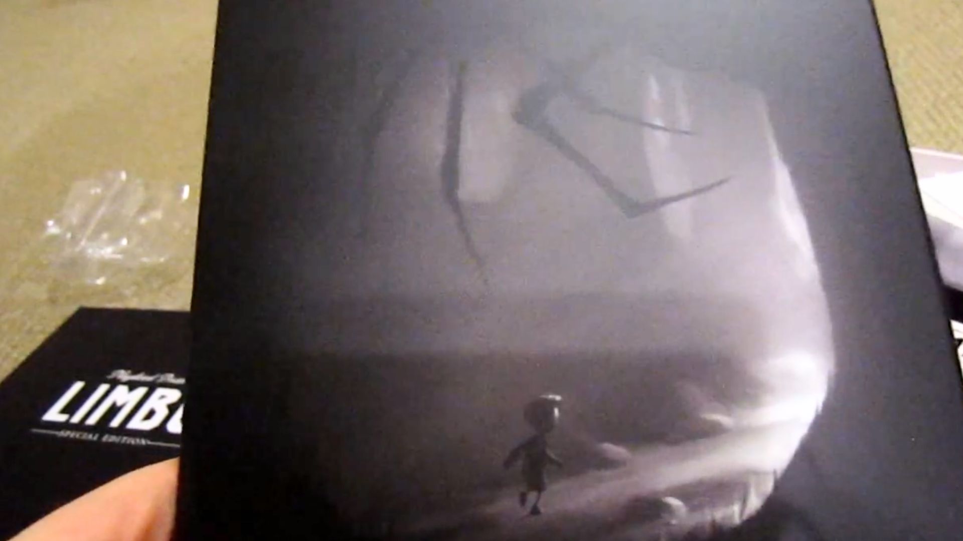 Limbo Special Edition Unboxing! by AndrewPWH1
7. Sleeping Dogs (2012)
Tattooed with drama, Sleeping Dogs landed with a cover that blended noir grit and Eastern iconography. You’re drawn to Wei Shen’s defiant face, flanked by dragons and gangsters. That composition mimics classic Hong Kong crime film posters, especially Infernal Affairs and John Woo's early works.
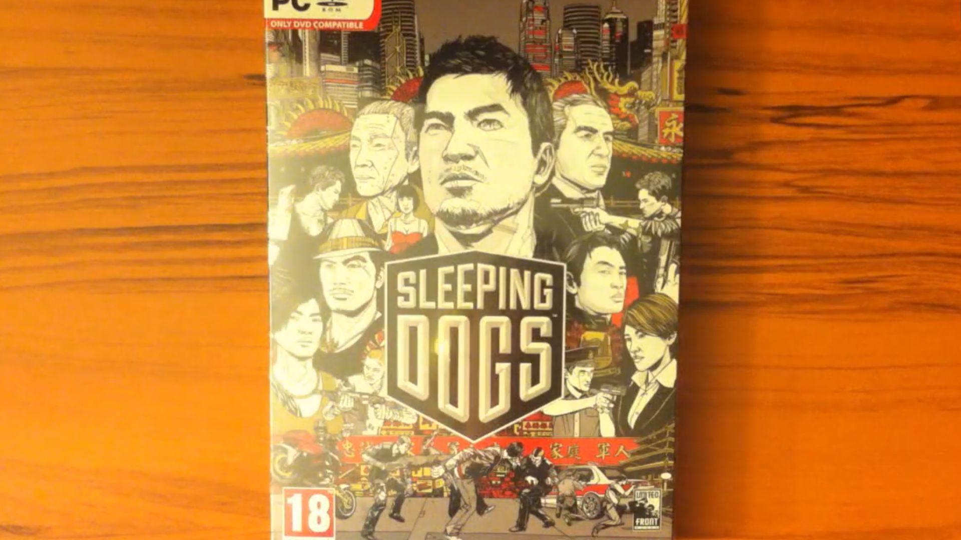 Sleeping Dogs 2012 Video Game Unboxing-Overview HD 720P by GhostXGaming
8. Resistance 3 (2011)
Skull-shaped New York was what Resistance 3 threw on shelves. Designed by graphic artist Olly Moss, the stark, blood-red poster-style art paid homage to 1970s political screenprints. The rifle embedded in the teeth was pure moss of visual metaphor and wartime paranoia.
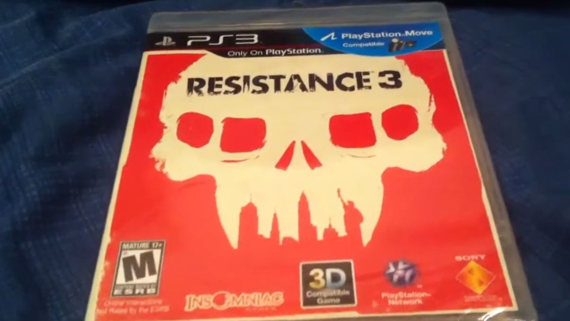 Resistance 3 Unboxing (720p HD) by Maniac536
9. Halo 4 (2012)
Halo 4’s cover placed Master Chief on center stage, surrounded by wreckage and light bursting from alien ruins. But the real shift was the first mainline Halo that Bungie did not develop. 343 Industries used ZBrush and Maya to rework every surface detail of that reflective armor design.
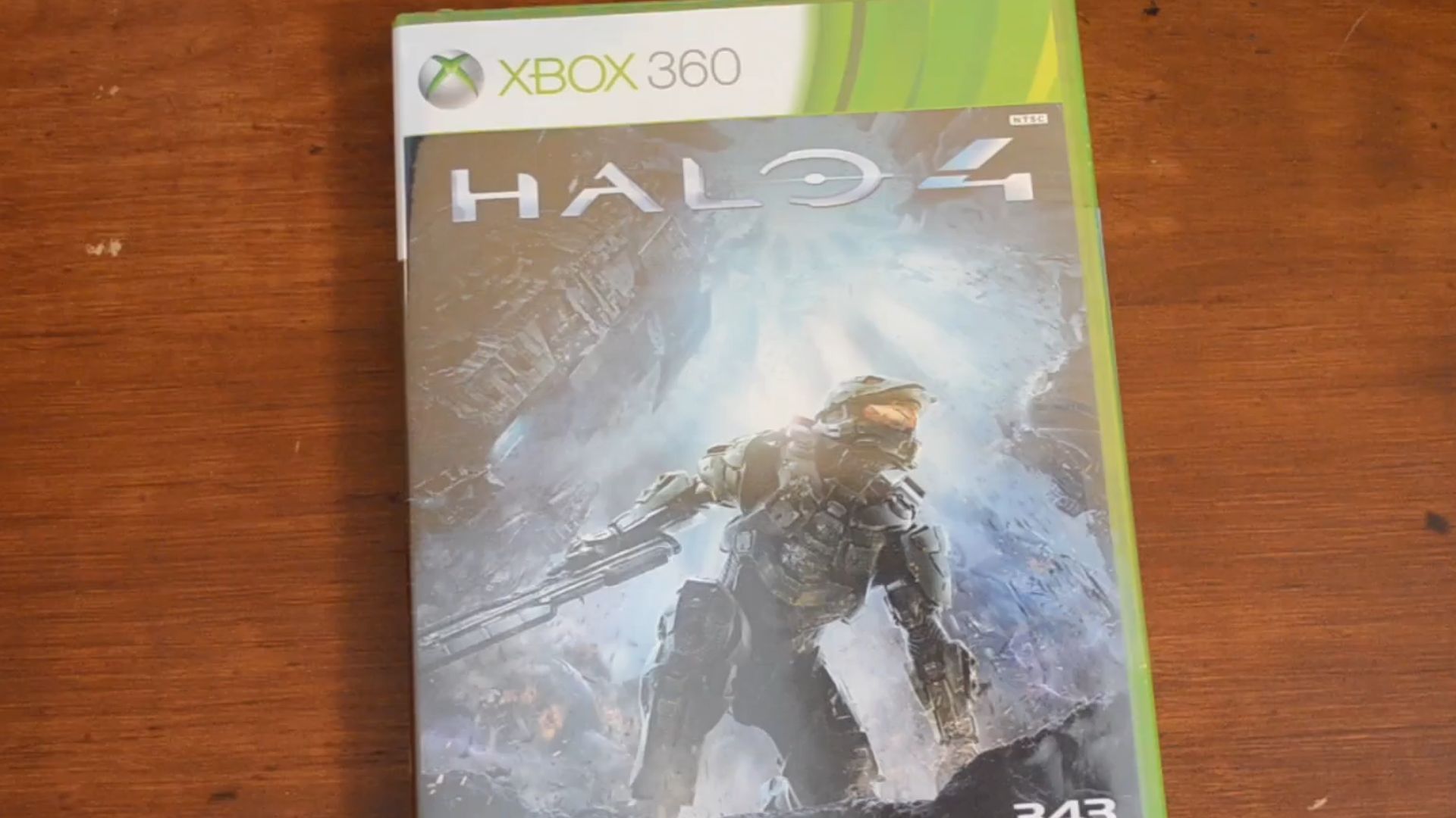 Early Unboxing: Halo 4 by Christian Atlas
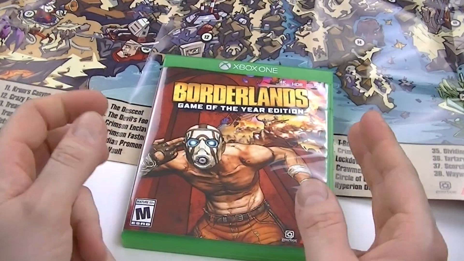
10. Borderlands (2009)
Bold and chaotic, Borderlands broke tradition with a psychotic twist: a bandit miming a gunshot to his head while comic gore explodes behind him. It visualized gameplay. The “graphic novel” aesthetic used cel-shading tech, later mirrored in Tales from the Borderlands.
 XBOX ONE BORDERLANDS GAME OF THE YEAR EDITION UNBOXING by MALICEDOLL79
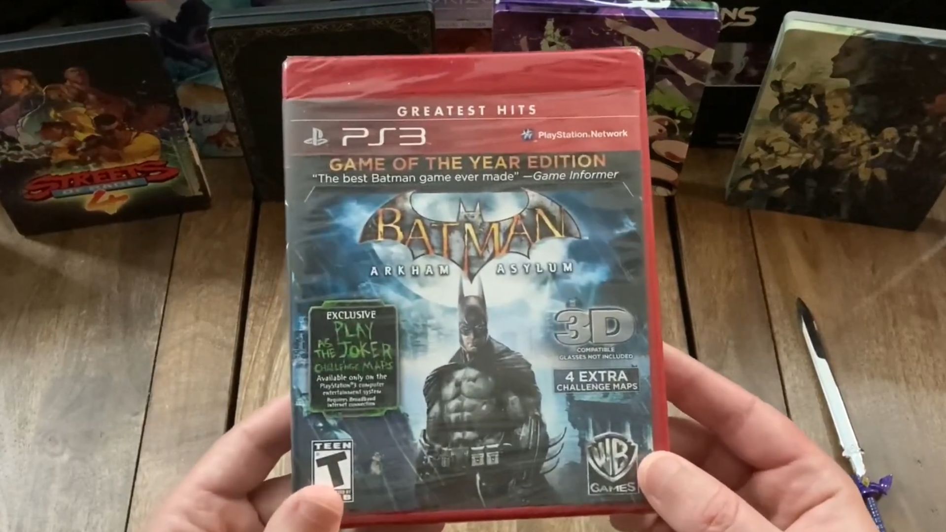
11. Batman: Arkham Asylum (2009)
Rain clings to Batman’s cape as Arkham looms behind him—gothic and brutal. The cover kept sidekicks and sunshine aside. Inspired by Batman: The Killing Joke’s psychological grit, the pose and angle echo comic artist Jim Lee’s moody character studies from Hush.
 Batman: Arkham Asylum - GOTY Unboxing (PS3) by 12-12 Games
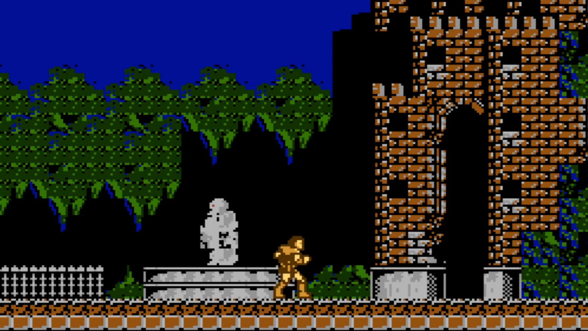
12. Castlevania (1986)
With vampires and looming castles, Castlevania’s 1986 cover delivered Gothic melodrama. Illustrator Tom Dubois channeled pulp comic aesthetics, which foreshadowed Dracula-fueled chaos. The background castle closely mimics Universal's 1931 Dracula set design—the game art borrowed from cinema's dark legends.
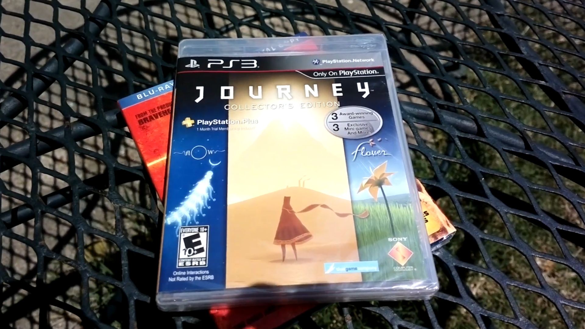
13. Journey (2012)
A cloaked figure ascends a sand dune beneath a blazing light beam—meditation in motion. The spare palette and triangular composition mimic religious iconography. Art director Matt Nava drew from Navajo textiles and minimalism to make the journey inward feel as vast as the desert.
 journey collection unboxing!!!! by generalthedestroyer
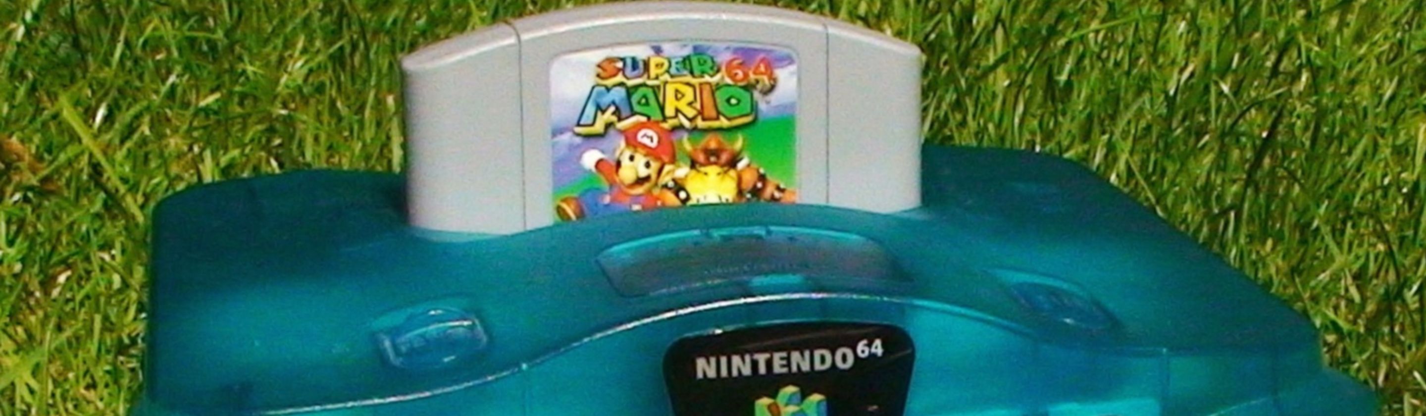
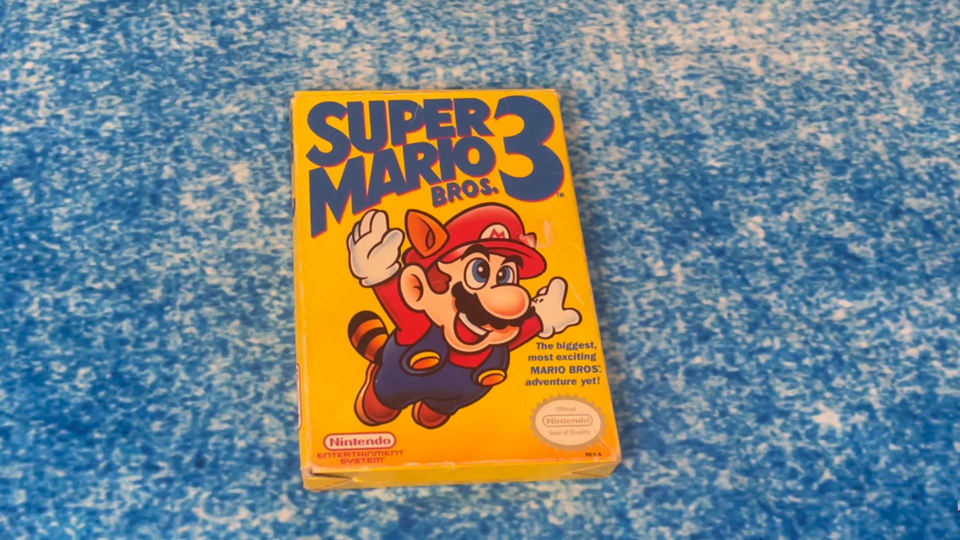
14. Super Mario Bros. 3 (1988)
Vibrant yellow and arms wide, Super Mario Bros. 3 showed a plumber mid-flight, inviting your imagination to soar. Nintendo chose that background to grab attention on store shelves. There was a raccoon tail drawn from Japan’s tanuki folklore, where shape-shifting animals outwit danger.
 Super Mario Bros. 3 Retro 👾 Unboxing 📦 & Gameplay! 🎮 by JLS Gaming
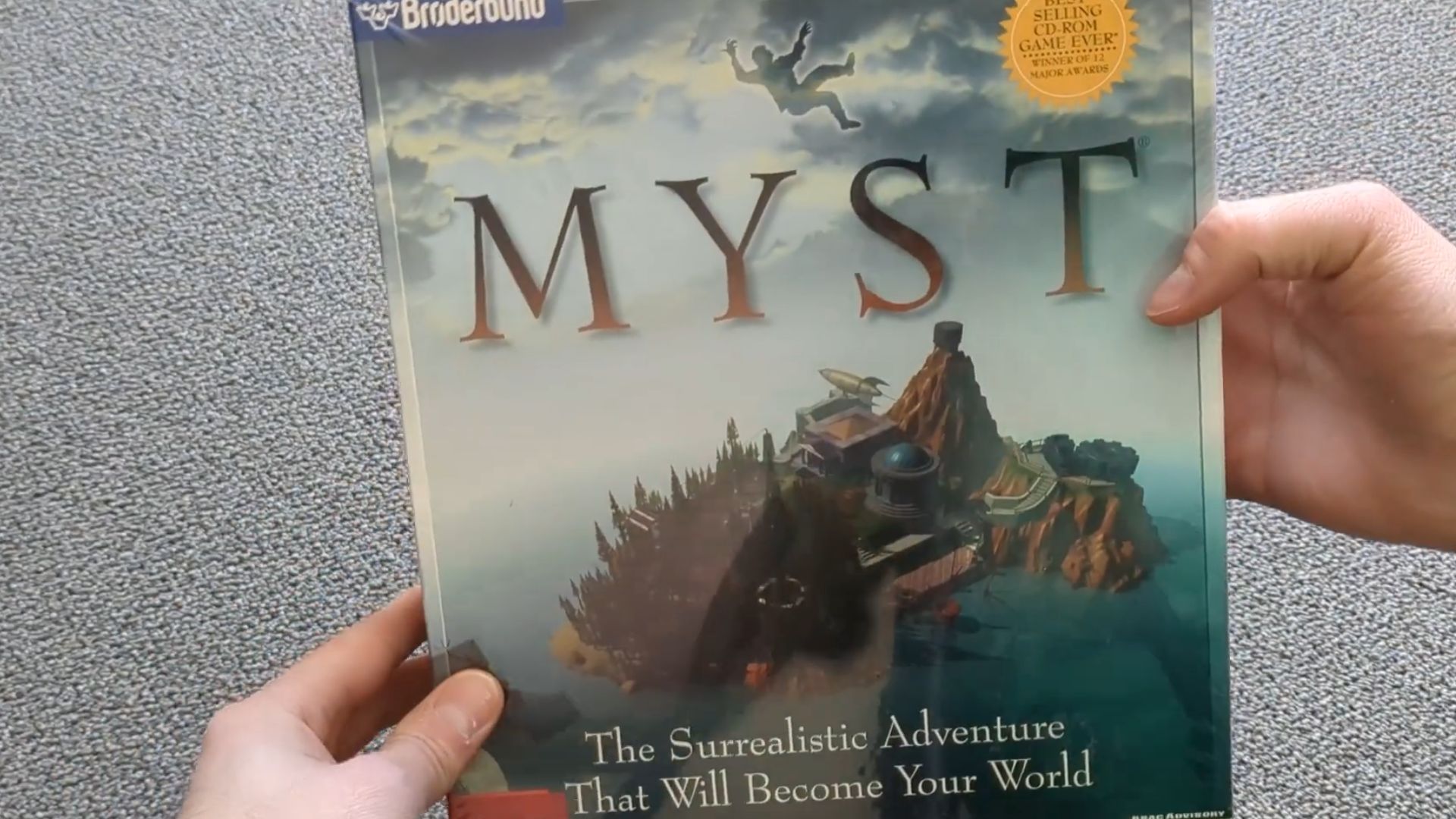
15. Myst (1993)
Myst’s cover looked lush and depicted a floating island that felt plucked from a dream. The tree and gears hinted at in-game puzzles. Cyan used real-life 3D modeling, an early use of Softimage and StrataVision 3D, to render that atmospheric island terrain.
 Unboxing MYST for Macintosh by VampireStrike
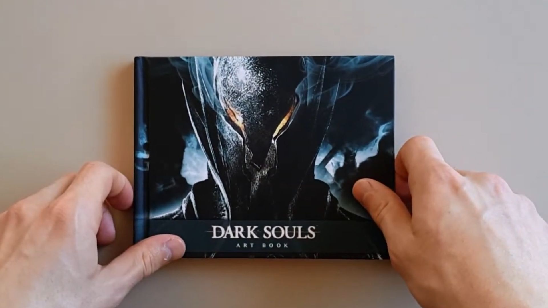
16. Dark Souls (Japanese Cover, 2011)
With blue fire licking around a knight, curled in despair, Dark Souls told you everything without a word. Studio FromSoftware consulted illustrator Masanori Waragai, whose earlier work in King’s Field inspired that somber pose. The Japanese cover eschewed action for contemplation.
 Dark Souls Limited Edition Artbook by Aykun
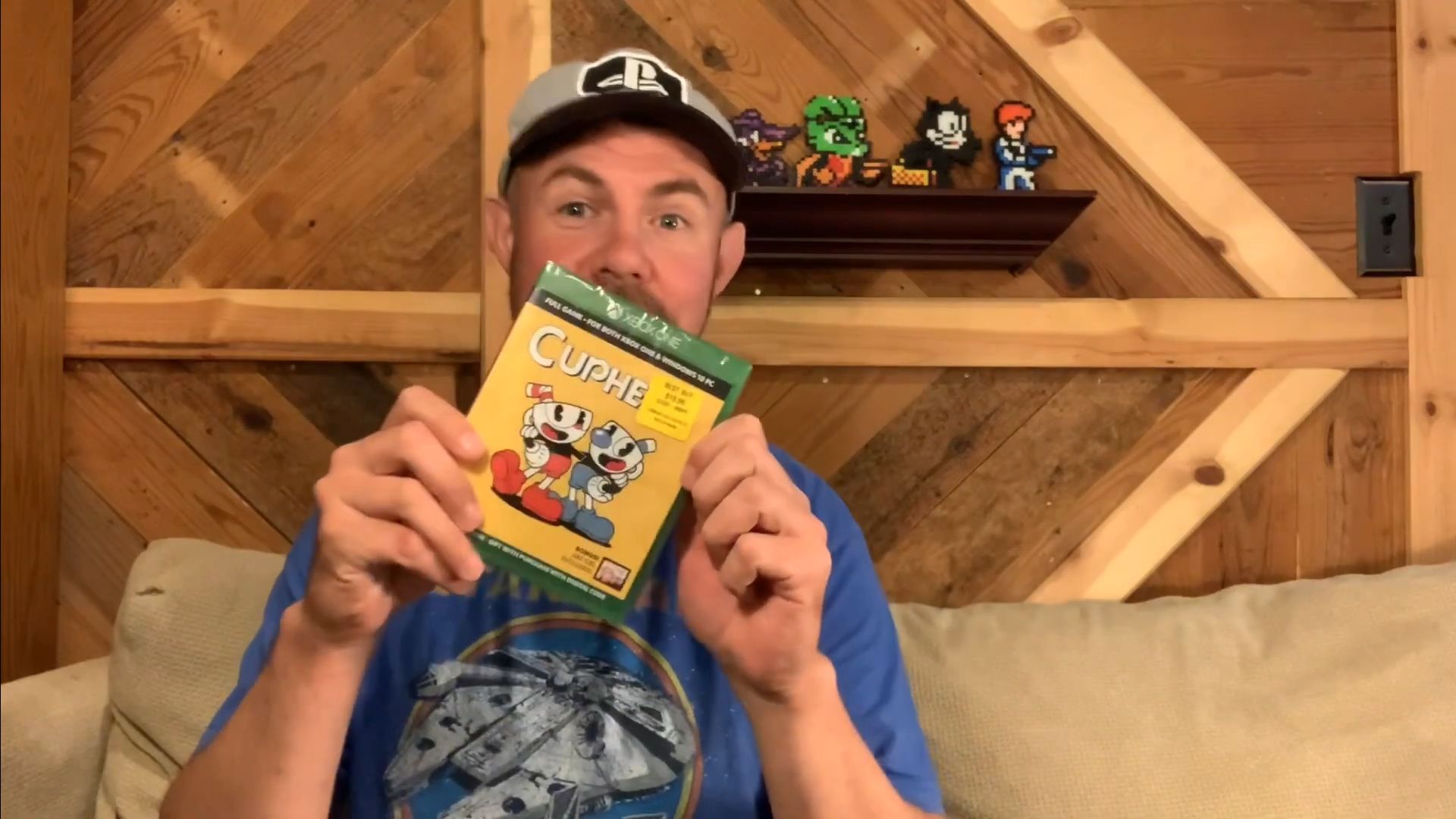
17. Cuphead (2017)
Cuphead’s cover featured grinning mugs and rubber hose limbs, which made it look like it leaped off a 1930s cereal box. Studio MDHR used hand-inked animation cells, scanned in HD, for both gameplay and promo art. An authentic halftone texture mimics vintage lithography from early Fleischer Studios posters.
 CUPHEAD "PHYSICAL” UNBOXING by PK In The Universe
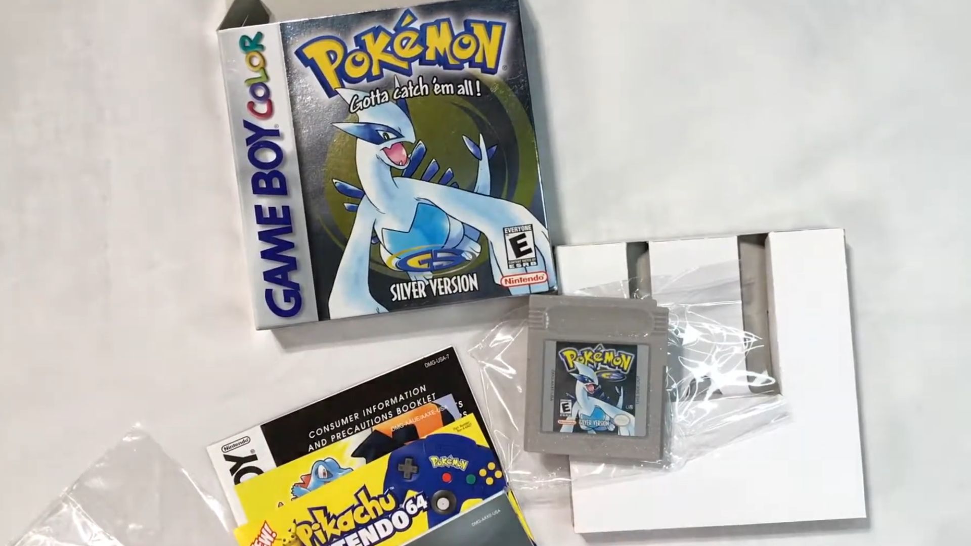
18. Pokémon Silver (1999)
With silver foil shimmer and Lugia diving forward, Pokémon Silver made catching legendaries feel graceful. The Game Boy Color box used reflective layering, a premium print process for the era. Lugia was designed specifically for the movie Pokémon 2000 and given star billing.
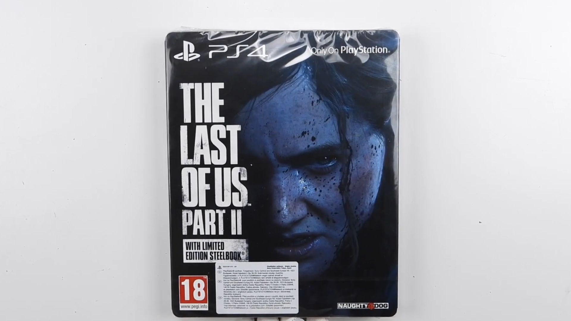
19. The Last Of Us Part II (2020)
The Last of Us Part II went with raw realism—Ellie’s bruised face, cold stare, and smudged blood. Naughty Dog used motion-captured photography layered with a digital brush-up. It was more about Trauma than action. The asymmetrical crop mirrors Ellie's fractured morality throughout the story.
 The Last of Us Part 2 LIMITED EDITION STEELBOOK Unboxing by EnterExit
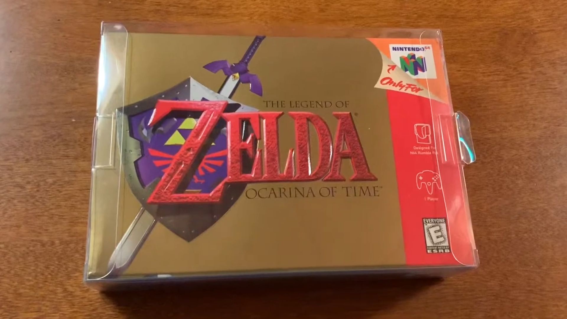
20. The Legend Of Zelda: Ocarina Of Time (1998)
Gold foil and a lone emblem are all Ocarina of Time needed. The Master Sword and Hylian Shield float in space and evoke medieval scrolls. Nintendo's minimalist box reflected confidence. No hero pose. Just a relic's promise of adventure and a legacy sealed in metallic ink.
 The Legend of Zelda: Ocarina of Time N64 Complete in Box Unboxing (Great Condition) by JTread03