With Great Color Comes Great Responsibility
Color can make a game look great, but the smartest games ask it to do much more. A carefully chosen shade can point you toward the next ledge, warn you that danger’s nearby, or show how a character feels without a word of dialogue. Some games build entire puzzles and combat systems around color, while others use it to make their worlds easier to understand. When done well, color becomes part of the experience rather than something added at the end to make everything look pretty. These 20 games found clever, memorable ways to use color in their stories, worlds, and gameplay.
1. Ōkami
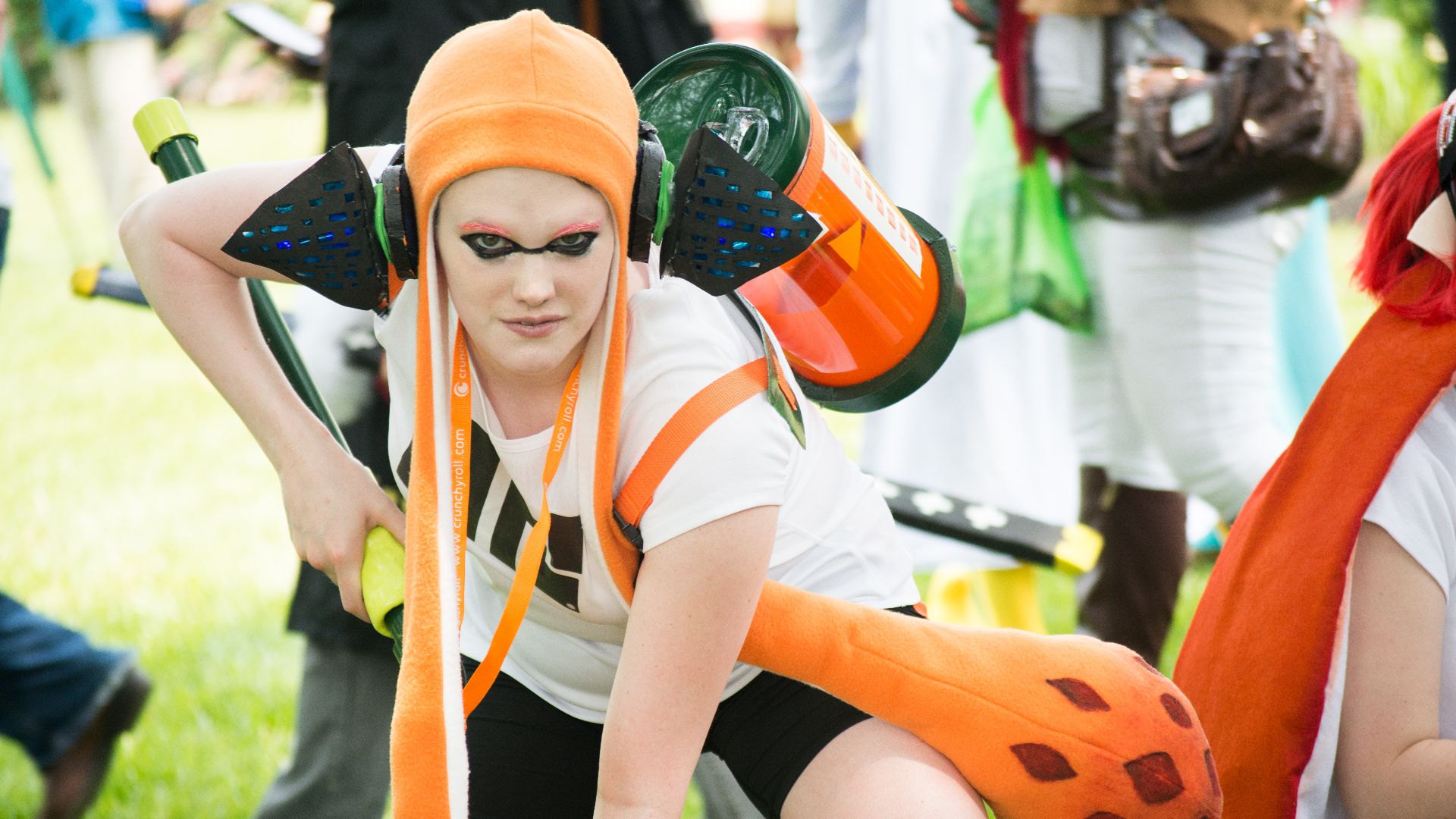
Ōkami presents its folklore-inspired setting in a sumi-e ink style, giving the main character, Amaterasu, the power to repair damaged landscapes with the Celestial Brush. Much of the world first appears faded, empty, or drained of life, so every act of restoration stands out.

2. Journey
Journey opens among calm yellow sands, moves through cold blue-green depths, and eventually reaches a mountain that’s almost completely colorless. The changing palette follows the traveler’s emotional and physical journey. Since there’s no spoken dialogue, those color changes do much of the storytelling and help every part of the trip feel different.

3. Gris
A representation of grief, Gris slowly incorporates different colors as you move through the levels. As each color returns, the watercolor world changes and new abilities give her more ways to move through it.
4. Splatoon
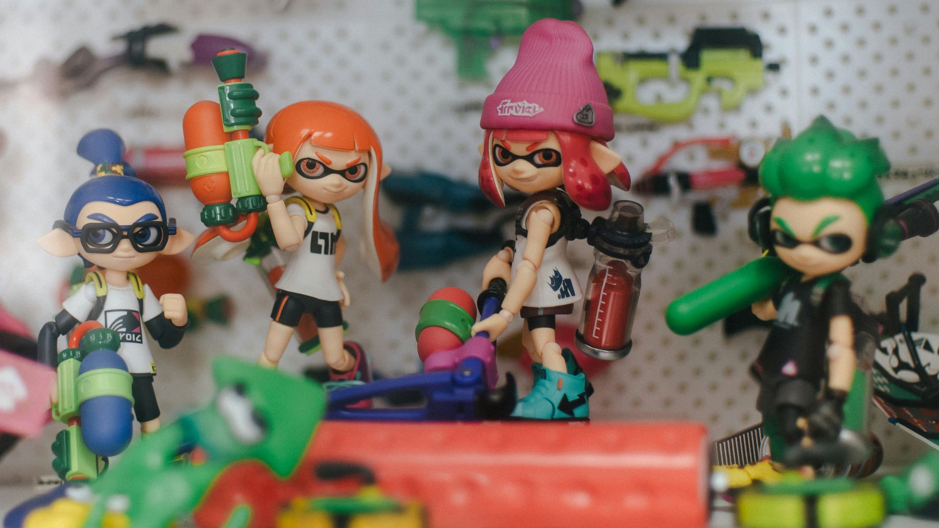
In Splatoon, ink marks territory, creates faster swimming routes, hides teammates, and slows anyone who steps into the opposing team’s color. The two team colors make it easy to tell who controls each part of the arena. By the end, every wall, floor, and ramp shows exactly how both teams pushed forward, lost ground, and fought to take it back.
5. Persona 5
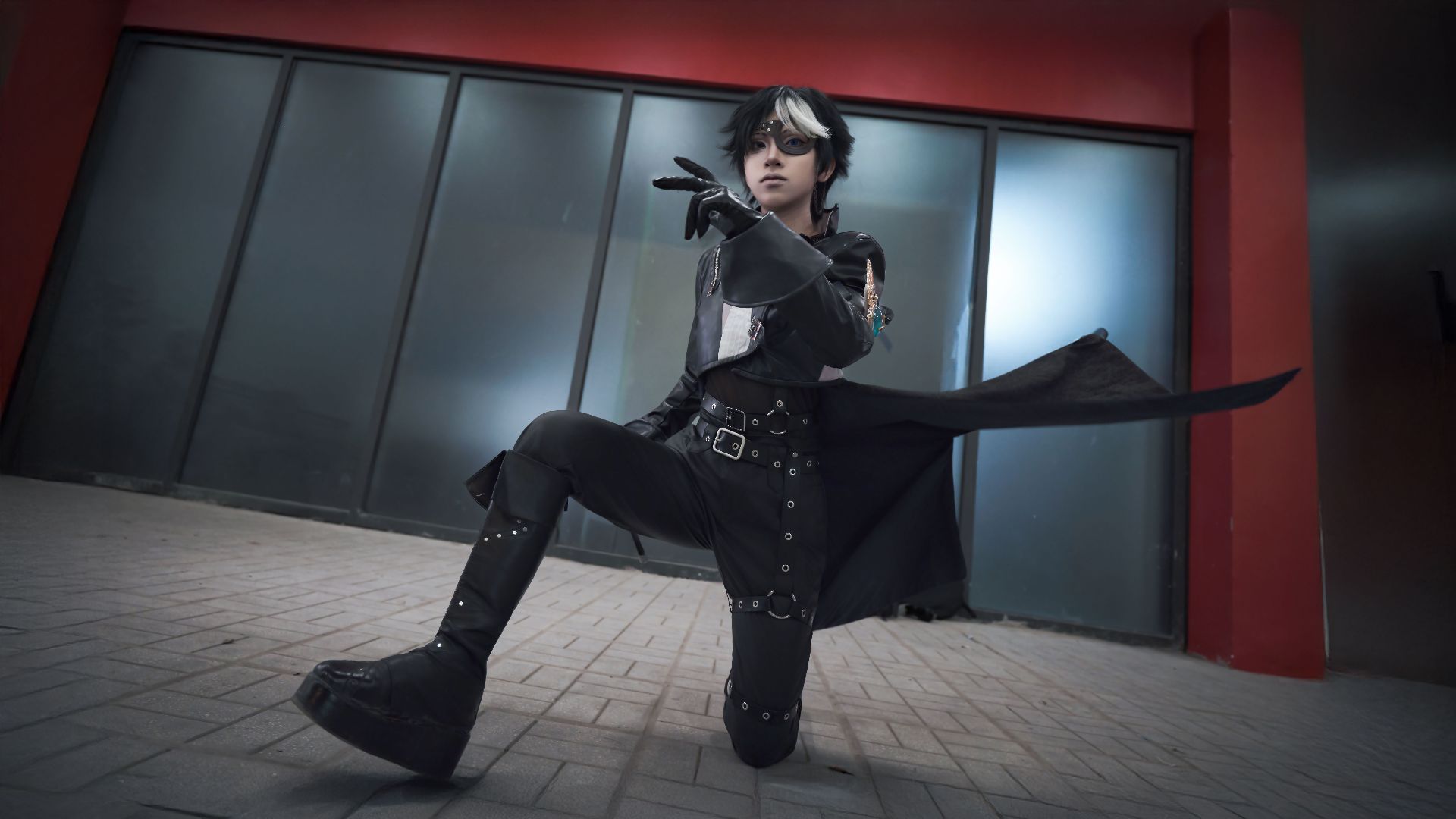
Persona 5 uses crimson, black, and white across its menus, dialogue boxes, shops, and status screens. Sharp layouts and quick animated transitions fit the game’s rebellious tone. Even routine jobs like checking equipment or buying supplies carry the same restless energy as the main story.
6. Mirror’s Edge
Mirror’s Edge places bold red objects against white buildings and clear blue skies to help the player find useful routes while she’s moving at speed. Pipes, doors, railings, and platforms can stand out through Runner Vision, giving players a quick sense of where to go next.
 DICE / Electronic Arts Photographer: MobyGames user Kam1Kaz3NL77 on Wikimedia
7. Superhot
Superhot divides its world into pale rooms, red enemies, and black weapons or objects you can use. That strict palette makes threats and tools easy to spot. With bullets flying and enemies closing in, the simple color scheme keeps the screen clear enough for you to make fast, careful choices.
8. Return of the Obra Dinn
Return of the Obra Dinn recreates the one-bit appearance of early Macintosh games. Strong outlines and limited shading keep faces, uniforms, and small clues readable while you study frozen moments aboard the ship. The stark look also gives every scene an old, archival quality that fits the game’s focus.

9. Cuphead
Cuphead uses traditional hand-drawn cel animation, hand-inked artwork, and watercolor backgrounds inspired by cartoons from the 1930s. Its warm, slightly worn colors help it look like an old animated short.

10. The Witness
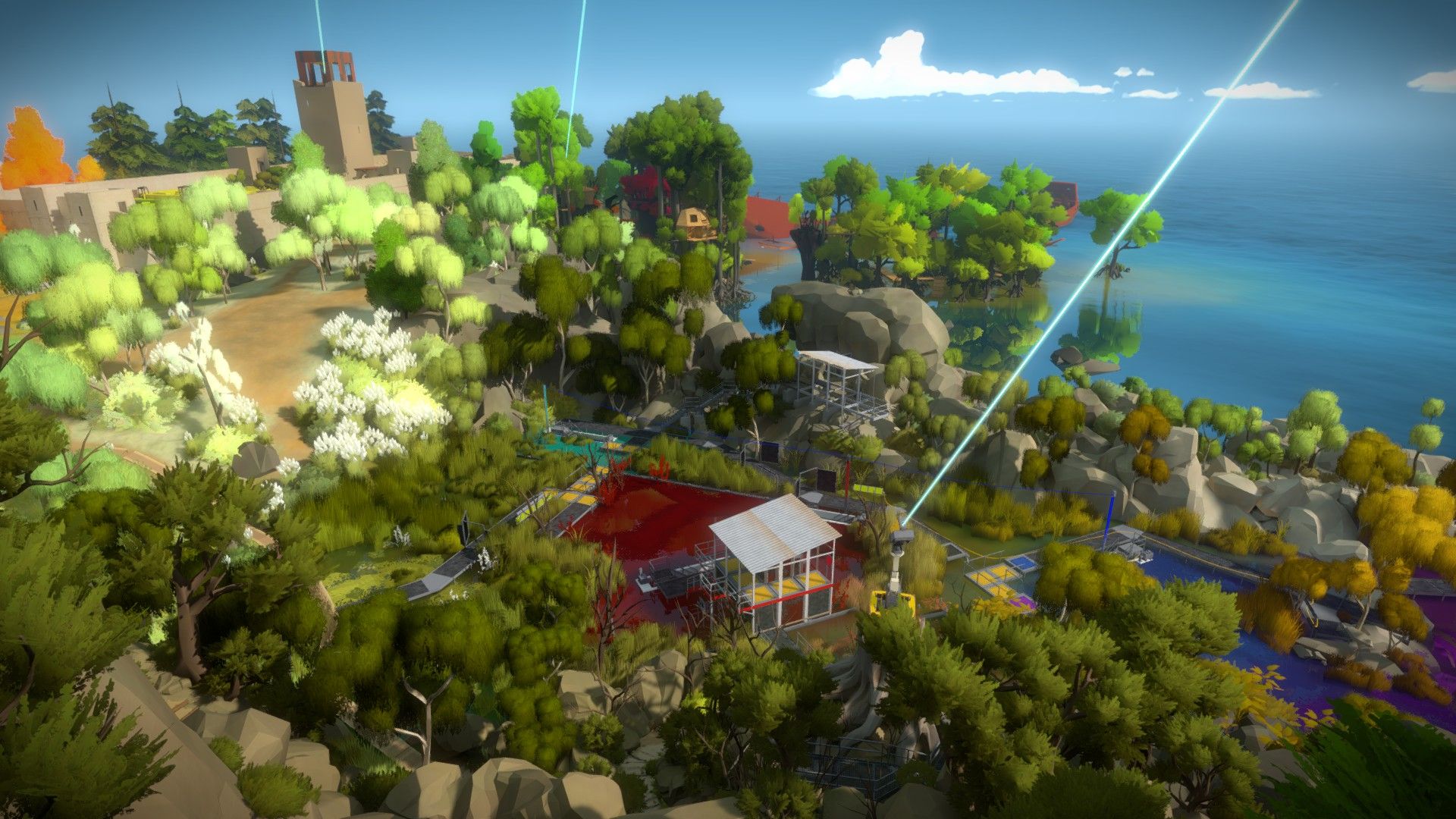
The Witness fills its island with bright color and strong contrast, yet it avoids filling the scenery with unnecessary clutter. Each region has its own look, puzzle panels are easy to spot, and environmental details catch your attention. This strict control suits a game built around close observation, where a small change in color or arrangement can help reveal a solution.
11. The Unfinished Swan
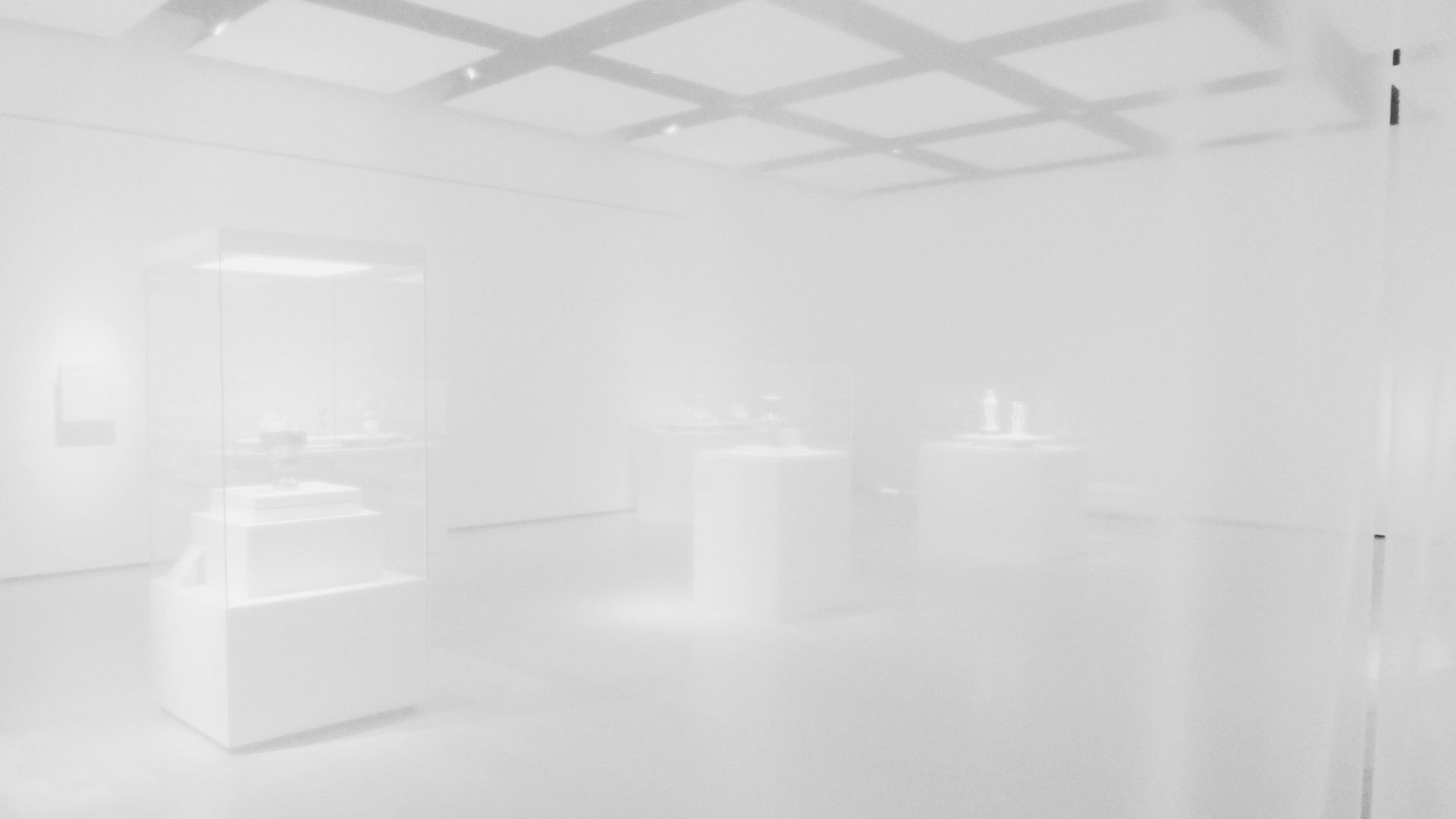
The Unfinished Swan begins in an all-white environment where you can’t see the walls, stairs, or statues around you. Throwing black paint reveals edges, shapes, and surfaces one splash at a time, slowly making the hidden space easier to understand. The black-and-white contrast becomes a practical way to explore.

12. Hue
Hue lets you change the background color so matching objects disappear both visually and physically. A wall can vanish, a platform can fall away, or a dangerous object can become passable when you switch to the right shade. Each change affects what you can cross, avoid, or use, turning color matching into the main component behind the game’s platforming and spatial puzzles.
13. Chicory: A Colorful Tale
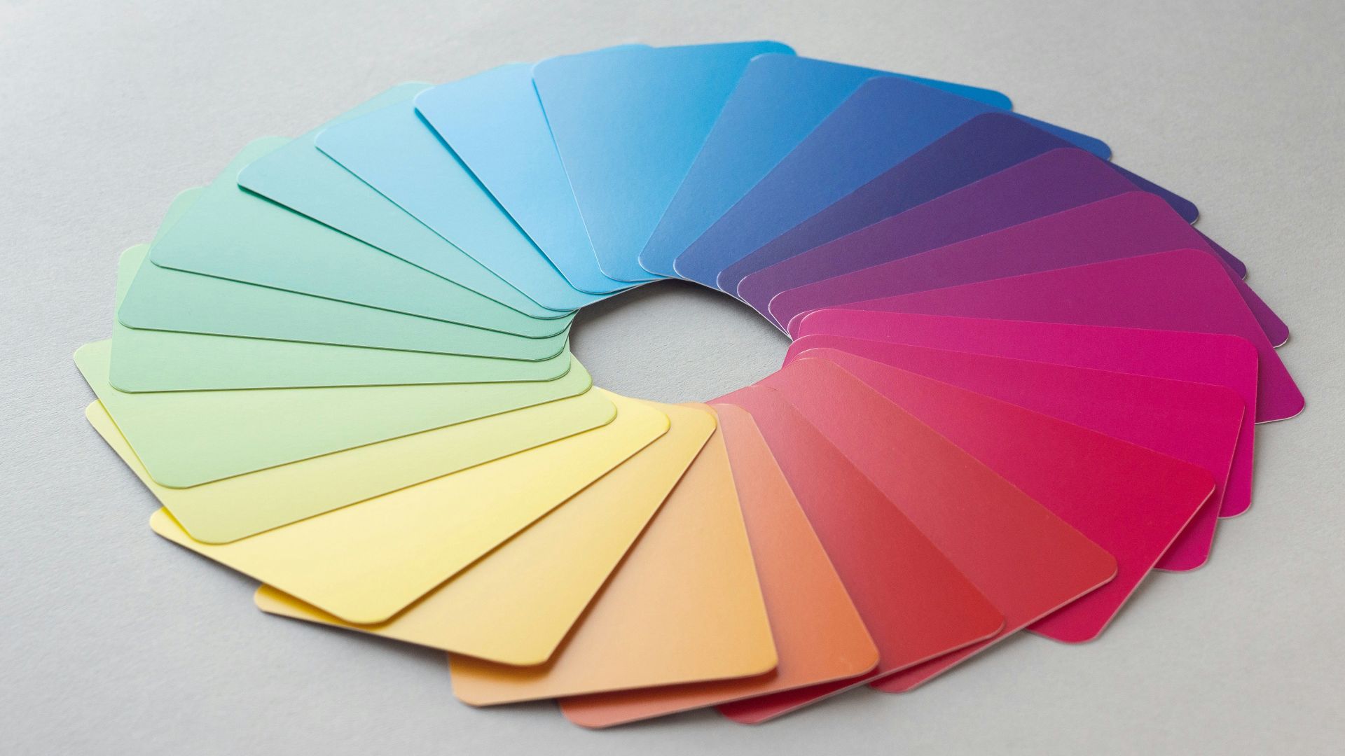
Chicory: A Colorful Tale starts with a black-and-white world, leaving most of its color in the player’s hands. Your brush can decorate towns and forests, affect plants and objects, and help solve puzzles along the way. Since your work stays visible, every painted area becomes a record of how you chose to interact with the world.

14. MadWorld
MadWorld presents its comic-book setting in hard black and white, saving red for its exaggerated violence. Blood stands out with intense clarity against the colorless surroundings, making every hit easy to see. The limited palette supports the game’s over-the-top approach.
15. Hyper Light Drifter
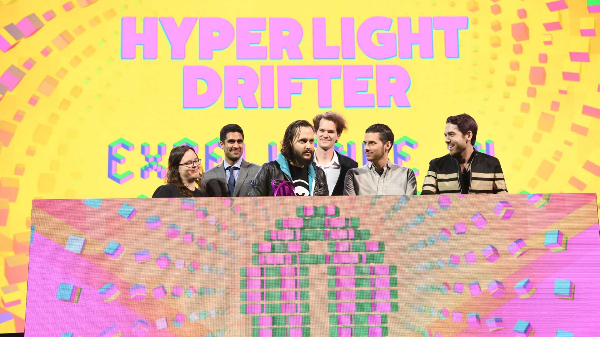
Hyper Light Drifter moves between bright pinks, deep blues, glowing greens, and heavy shadows to build the mood of its ruined world. Since the game offers little written explanation, its changing palettes help separate regions and give each one its own atmosphere.
16. Monument Valley
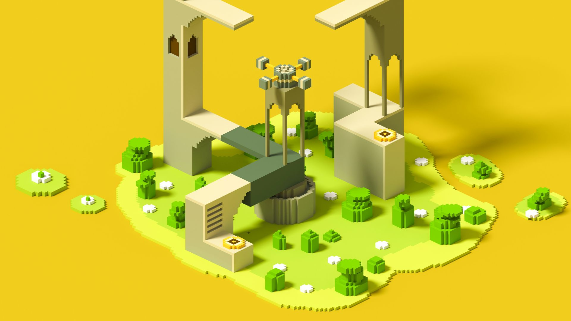
Monument Valley presents optical illusions and impossible architecture through carefully chosen palettes that give every level its own clear look. Shape and contrast help players recognize paths, switches, characters, and moving structures. The clean color schemes keep those strange spaces understandable without taking away from their carefully arranged design.
17. Control
Control places pulsing red light against the gray concrete walls and plain office interiors of the Oldest House. The color marks hostile supernatural activity and enemy presence, often changing the feeling of a room before a fight begins. As the Hiss spreads through the building, red becomes a steady warning that the space has been altered or taken over.

18. Tetris Effect
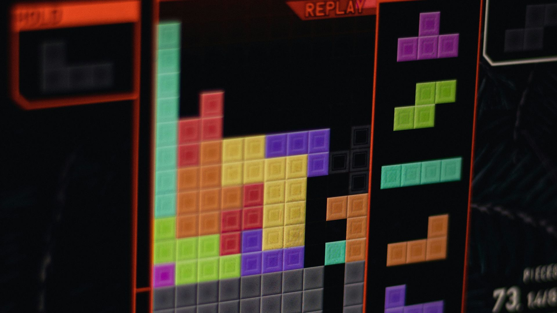
Tetris Effect surrounds the familiar puzzle grid with particle-filled environments that pulse, scatter, and change with the music. The visuals grow calmer or more intense while staying separate enough from the playfield to keep classic Tetris easy to follow. Every rotation and cleared line becomes part of the larger presentation, bringing color, movement, and sound together without hiding the puzzle underneath.
19. Ikaruga
Ikaruga lets its ship switch between black and white polarities at any time. Bullets that match your current color can be absorbed, while fire of the opposite color causes damage. Survival depends on reading colors quickly and deciding when to switch, when to attack, and when to absorb incoming fire.
 Art Institute of Chicago on Unsplash
20. Sayonara Wild Hearts
Sayonara Wild Hearts moves through purple, pink, and blue dreamscapes built around its pop soundtrack. Clear colors and simple shapes separate hazards, targets, characters, and vehicles as they rush past at high speed. The action stays easy to follow while the game keeps the bright, polished look of an animated album cover.